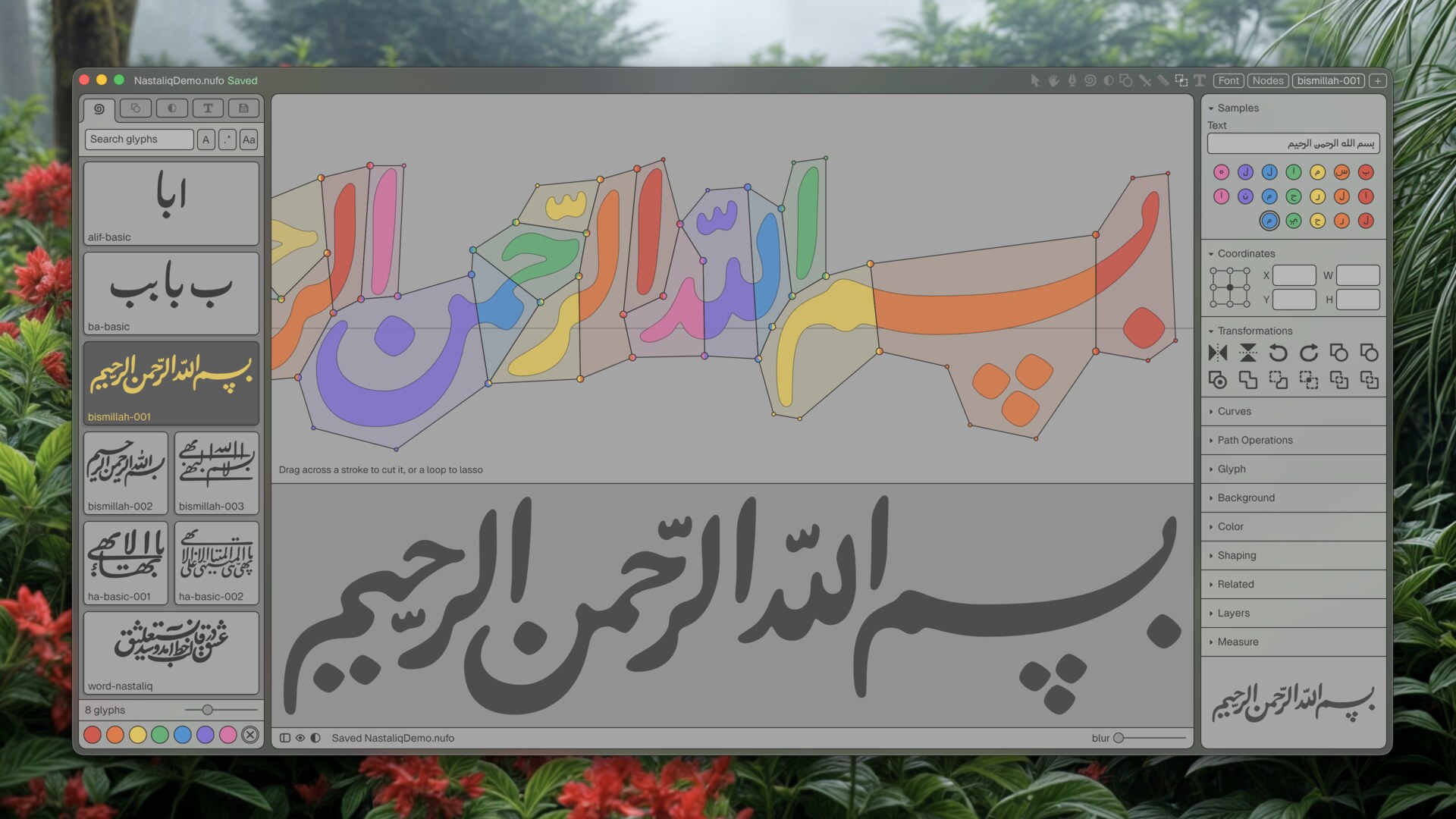
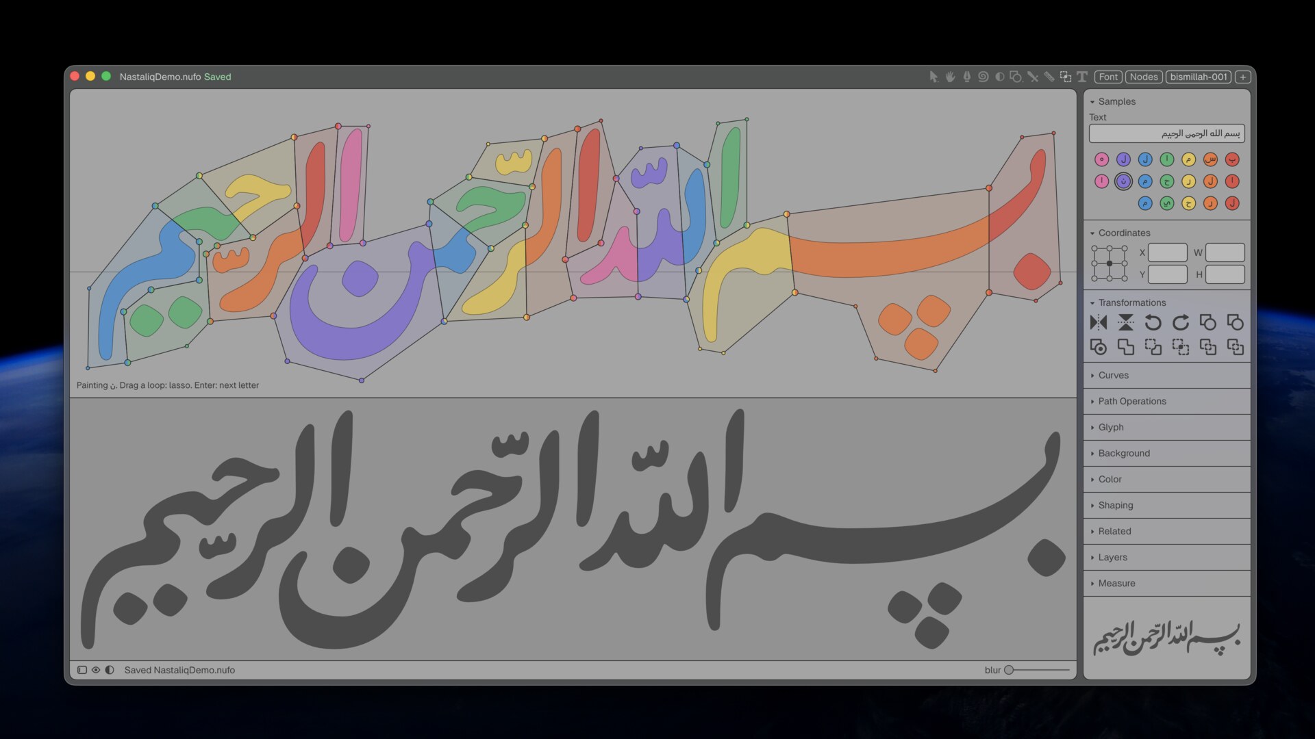
Runebender with a bismillah labeled for training: each letter’s ink inside a colored polygon.

Nasta’liq Distilled

Post-OpenType
Neural Network Fonts

Eli Heuer 2026

I make font tools. This talk is about a font that is a neural network.

Based on the blog post at elih.net/blog/nastaliq-distilled.
A clay bunny pushing a square block toward the round hole of a shape sorter.

A dozen or so years ago, I was able to sit down with Eliyezer Kohen, one of the original inventors of OpenType Layout, and talk through the difficulties of cascading Arabic. He told me something that neither I nor any of my colleagues working with Arabic to that date had been aware of: he never expected OTL to be able to handle cascading Arabic, which he considered to be outside the scope of the technology. Unfortunately, this information was lost because Eliyezer had left Microsoft before OpenType became widely adopted. As Eliyezer put it to me at the end of our conversation, he had been happy in the mid-1990s to target 98% of the world with OTL and for Tom Milo to have the rest.

A lot of time and effort has been wasted over the years trying to force cascading Arabic into OTL.

John Hudson, TypeDrawers, July 31
typedrawers.com/discussion/comment/72005

John Hudson, on talking with Eliyezer Kohen, one of the inventors of OpenType Layout.

Why Nasta’liq

A relatively nonlinear and freeform style of the Perso-Arabic script. A calligrapher can stack words, extend strokes, and move letters and dots to balance black and white space.

Of all the major styles it is the one worst served by OpenType.
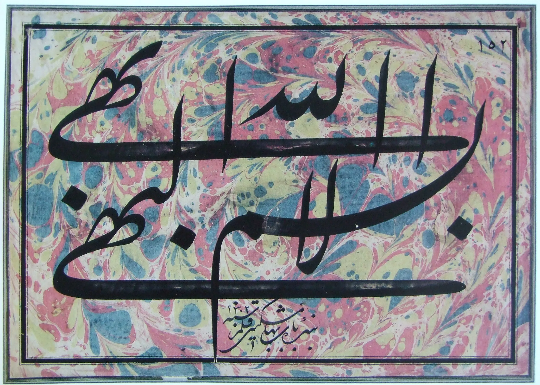
Nasta’liq calligraphy by Mishkín-Qalam.
Calligraphy by Mishkín-Qalam (1826–1912). Public domain, via Wikimedia Commons.
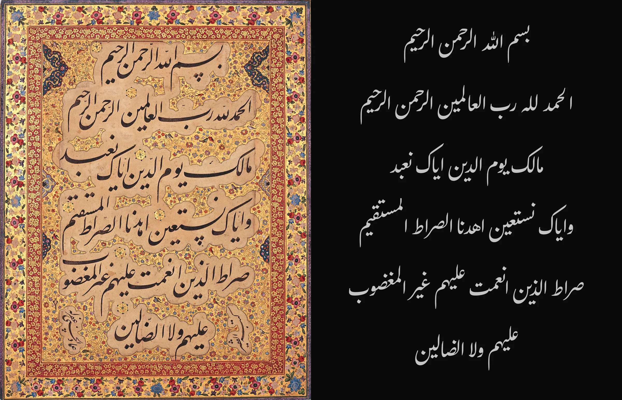
Al-Fatiha by Mir Emad Hassani on the left, the same lines set in Gulzar on the right.
Left: Al-Fatiha by Mir Emad Hassani (1554–1615), National Museum of Iran. Public domain, via Wikimedia Commons. Right: Gulzar.

You do not need to read Nasta’liq. Look for the differences between the two sides.
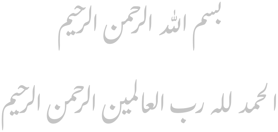
The first two lines of Al-Fatiha set in Gulzar.
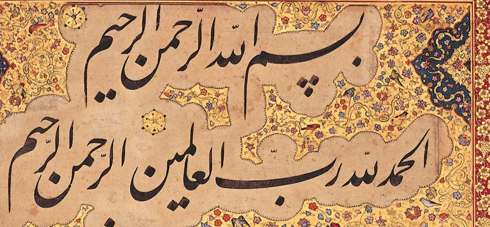
The same two lines in Mir Emad Hassani’s calligraphy.

The same two lines, closer. Look at how the calligrapher stacks, stretches and spaces them.
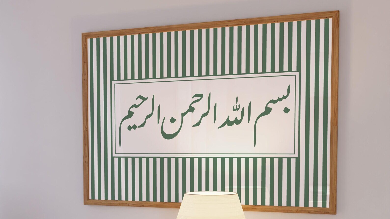
A framed print of the bismillah set in Gulzar, hanging above a dresser.

This is what people buy and hang on the wall. The same line as the calligraphy, set as type.

This font is a neural network

A small feed-forward network: Unicode and neighbors in, a signed distance field out.

1.36 million weights: 5.4 MB at 32 bits, 1.38 MB quantized to 8
No OpenType shaping at runtime
Rust, WASM, Linebender, img2bez

OpenTypeNeuralType
UnitGlyph in a boxShape from context
BehaviorGSUB, GPOSLearned
FileOutlines, tablesWeights
EngineHarfBuzzNeuralType
  • Click in the demo. Type. Space separates joined letters.
  • Try the sample list: نور على نور, درد عشق.
  • Switch precision 32 / 16 / 8 bit.
  • Esc to leave the demo, then → to continue.

Trained at home

Distilled from Gulzar: 91,390 examples from 30,783 strings of one to three letters, 1,150 distinct shapes.

Rust and Candle on an NVIDIA RTX 2060 SUPER with 8 GB. About 100 seconds per epoch.

Validation IoU 0.945 on held-out short strings.
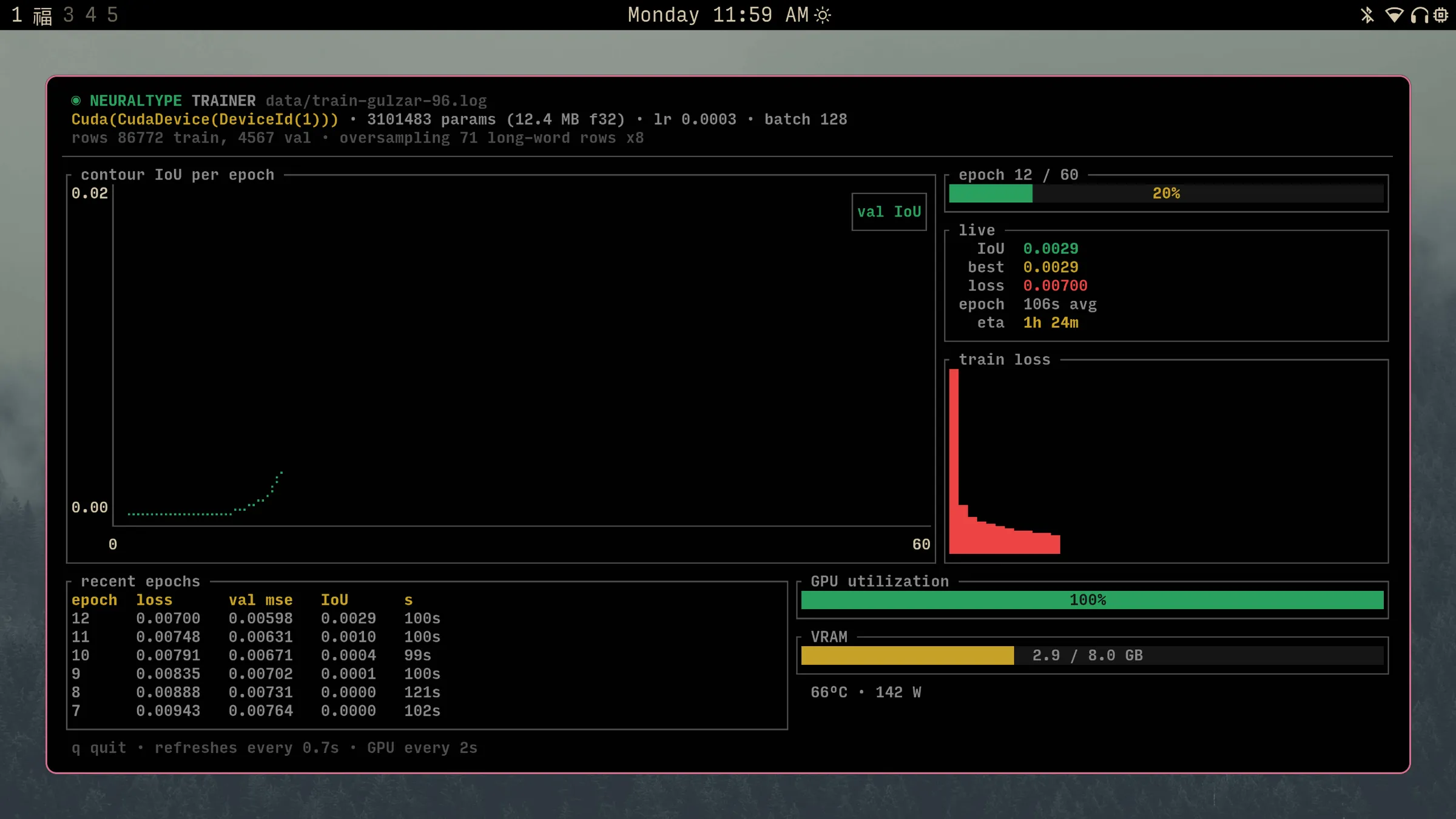
A terminal dashboard showing training progress, loss, validation IoU, and GPU use.

Training and inference both run locally. Independent designers can do this with full control of their data.

IoU: overlap divided by union. 1.0 is identical. It measures shape, not position, and not new words.
Field to outline

A fast tracer draws while you type. When input settles, img2bez replaces it with a cleaner Bézier outline in a Web Worker.

Here img2bez traces a raster glyph. In the font it reads the field directly.

Hold space over the demo to flip structure and preview. Esc, then →.

Distillation shows this is possible.

It is not the right design.

The model copies a font that was built for movable-type thinking: one glyph in one box, with rules between boxes. Distilling it carries those limits into the network.

Runebender with a labeled bismillah and its preview.

Runebender

Switch to Runebender now. About two minutes.

Trained from the labeled .nufo alone. No OpenType font, no starting weights.

Drag the end of بب. The font draws the ب between the short and long drawings.

  • Drag the end node of بب to the left. The ب stretches.
  • Esc to leave the demo, then → to continue.

Thank you

elih.net/blog/nastaliq-distilled
runebender.org
github.com/eliheuer/post-opentype
eli@elih.net

0:00
→ next · ← previous · R reset timer · keys here drive the deck