The Garden & the Fire:
Engineering OpenType Nasta’liq
Warning (Work in progress)
This post is a live build log for a project under active development. Parts of it are drafted with AI assistance and may contain unedited AI slop. Details can change as the work continues.
Golshan is a fork of Gulzar. I am very bearish on the idea of OpenType nastaliq fonts. But I am trying to build one anyway as a way to better understand the problems and limits.
This post is a build log. I will update it as the work continues. Each section records what we did and why we chose it.
1. The first specimen
The first target was a single image: the bismillah, light gray on dark gray, and nothing else. One image is enough to force the whole pipeline to exist. To render it, the font must build. To build the font, the 2022 toolchain must run on a 2026 machine. The specimen is the test that the project is alive.
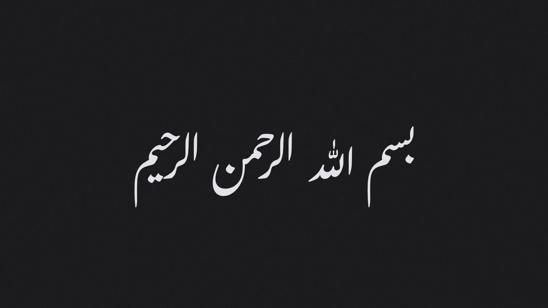
The specimen renders with DesignBot,
my Rust 2D graphics tool. A small script in the repo,
harness/designbot/bismillah.rs, loads the built TTF, shapes the text,
and writes the PNG. The same setup drives the proof sheets for
Virtua Grotesk.
2. A faster build with fontc
Gulzar builds in two stages. First, fontmake compiles the Glyphs source
into a TTF with no layout. Second, fontTools.feaLib merges a large
generated feature file into that TTF. The feature file comes from FEZ
sources through fez2fea, and this generation step is the slow part.
Golshan keeps the second stage and replaces the first.
fontc, the Rust compiler from
Google Fonts, compiles the outlines with --skip-features and
--no-production-names. The build script caches the generated feature
file, so an outline edit does not regenerate the layout. The full build
runs in about 70 seconds on my machine. The quick path
(./build.sh --quick) reuses the cached features and takes a few
seconds.
The hard part was the Python toolchain. The fez/karakul stack froze in
2022, and 2026 packages break it in six different places. The venv now
pins one consistent era: Python 3.10 (the last version with a
kerndeterminer wheel), fontFeatures==1.7.4, fez-language==1.3.4,
babelfont==3.0.1, kurbopy<0.10, numpy<2, setuptools<81, and the
variable-arithmetic fork of fonttools that karakul expects. Each pin
fixed a real crash. The lesson is old but worth repeating: a font with a
custom build system is a software project, and software rots.
3. The renderer was the bug
The first specimen render came out wrong. The letters sat flat on the baseline and most of the dots were gone. The font was innocent: HarfBuzz shaped the same TTF correctly, with full cascades and attached dots.
The first bug was in DesignBot. Its glyph loop advanced the pen with
glyph.advance and ignored glyph.x and glyph.y, the per-glyph
placement offsets from the shaper. Those offsets carry all of GPOS mark
attachment and all cursive rises. Flat Latin text hides this bug almost
completely. Nasta’liq is the worst case: in Gulzar, the whole word image
hangs from cursive attachment, so every letter above the baseline needs
its offset. Two lines fixed it, and the cascade appeared.
The render still had broken word images: wrong connection variants in
places, and no Allah ligature. To separate font bugs from renderer
bugs, I wrote a ground-truth renderer (scripts/hb-proof.py): HarfBuzz
shapes the text, FreeType rasterizes the glyphs, nothing else in the
path. The ground truth was correct. So the font was right, and the
renderer’s shaper was wrong.
DesignBot laid out text with parley 0.2, which shapes with swash, and swash misses some of what Gulzar demands. Parley 0.6 replaced swash with HarfRust, the official Rust port of HarfBuzz. So the fix was an upgrade to parley 0.8: one evening of API migration, plus one sign flip (parley now reports glyph offsets y-down). After the upgrade, the DesignBot render matches the HarfBuzz ground truth exactly.
This is a recurring pattern with complex-script text. A renderer can look correct for years because Latin never exercises the code path. Nasta’liq is a free stress test, and Gulzar may be the hardest shaping workload in any production font. If your text stack renders Gulzar correctly, it probably renders everything correctly.
4. Raising the unconnected alif
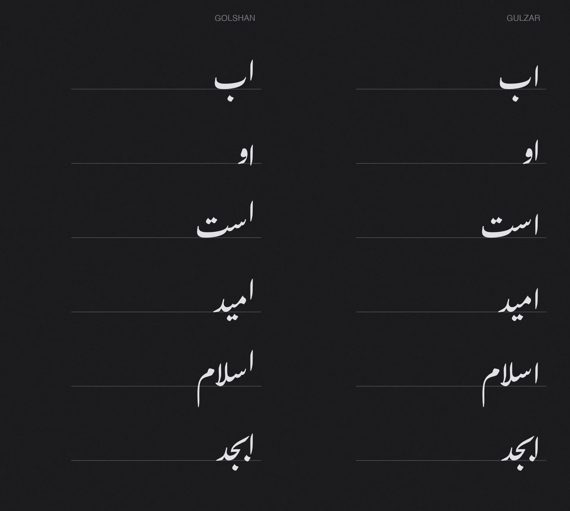
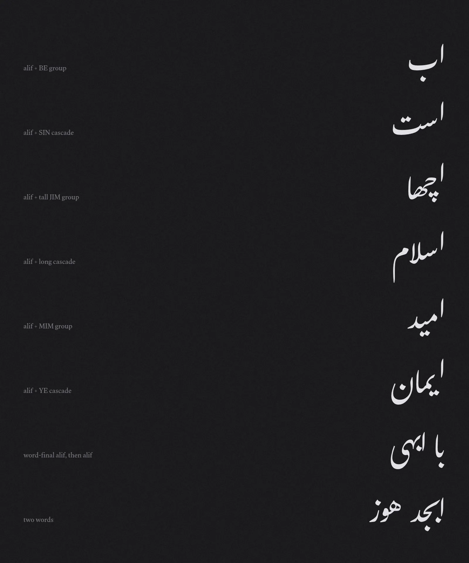
Now the first change to the font itself. The figure below shows the result. Upstream Gulzar is on the right, Golshan on the left, with a rule marking the baseline. In Gulzar, every unconnected alif stands on the baseline. In Golshan, it floats at the height where the next letter begins.
The problem
Alif joins only on its right side, so Nasta’liq text is full of unconnected alifs: at the start of words and in the middle of them. A Nasta’liq letter group is a cascade. The first letter starts high, and each following letter steps down until the last one rests on the baseline. When an alif comes before a group, a calligrapher does not drop it to the baseline. The alif hangs in the air, and its foot meets the point where the next stroke begins.
Gulzar’s engineering notes call this hard to express in OpenType
Layout, and the released font does not attempt it. The obstacle is in
the design of cursive attachment. A cursive lookup gives each glyph one
entry anchor and one exit anchor, and every entry connects to every
adjacent exit inside the same lookup. Gulzar’s main cursive lookup uses
this to build the cascade: medial and final glyphs carry entry,
initial and medial glyphs carry exit. If you now add an entry
anchor to the initial letters, you do not get an alif connection. You
get every medial and initial exit in the font connecting into initial
letters, which is wrong everywhere except after an alif. The notes
propose a contextual cursive lookup as a way out, marked untried.
The fix: scope by anchor name, not by context
The contextual lookup is not necessary. OpenType allows more than one cursive lookup, and each lookup only connects its own anchor pair. So Golshan adds a second cursive lookup with a pair that nothing else uses:
cursive_exitexists only on the isolated alif glyphs, placed at the foot of the stroke.cursive_entryexists only on initial and isolated forms, placed at the pen-entry point of the glyph.
Inside this lookup, the only possible connection is alif to a following letter. The anchor names do the scoping. No context, no duplicated lookups, no interaction with the main cascade rules. In the FEZ source the whole feature is one line next to the main cursive routine:
Feature curs { Routine CursiveAttachment { Attach &entry &exit cursive; } IgnoreMarks RightToLeft; Routine AlifRaise { Attach &cursive_entry &cursive_exit cursive; } IgnoreMarks RightToLeft;};The RightToLeft flag matters. It tells the shaper to resolve the
attachment so that the later glyph holds still and the earlier glyph
moves. The word stays planted on the baseline, and the alif is the
glyph that rises.
The alif rides the cascade
The best property of this fix comes free. HarfBuzz resolves cursive attachments from all lookups into one attachment tree per word. The alif attaches to the first letter of the group, and that letter already rides the group’s cascade from the main lookup. So the alif does not rise by a fixed amount. It rises to the entry height of the group, wherever the cascade puts it.
The shaper output shows the chain. In «امید» the initial mim rises 229 units and the alif lands at 266: the rise of the mim plus the height of its entry point. In «الرحمن» the lam rises 433 units with its cascade and the alif rises with it. One lookup, and the alif tracks any group the font can build.
Anchors from a script, not by hand
Gulzar has 341 initial and isolated glyph forms. Placing an anchor on
each one by hand is a week of work, and every outline revision breaks
it. Golshan computes the anchors at build time in
scripts/add-alif-anchors.py, before the FEZ rules run:
- For each target glyph, the script gathers the outline points, with components resolved through their transforms. The pen-entry point is the highest point in the right part of the glyph (the rightmost 30% of its width).
- On the alif glyphs,
cursive_exitgoes at the foot of the stroke, with a small tuck constant so the alif overlaps the entry, as in the manuscripts.
The first version placed cursive_entry at the pen-entry height for
every glyph, and it failed in an instructive way. For body-height
letters (mim starts at 229, sin near 260, be near 300) the rule is
right: the alif foot meets the start of the connecting stroke. But for
tall-stemmed letters the pen enters at the top of the ascender, 450 to
670 units up. The alif climbed to the stem top, plus the cascade, and
landed as high as 810 units in «الرحمن». On screen it read as a
detached tick floating over the word. The word images looked broken.
The manuscripts show the real rule. Before a lam, the alif does not climb to where the pen enters. It stands beside the stem the way the lam-alif ligature stands: feet level at the stem base, tops level, and the cascade lifts the pair together. So the anchor script now has two regimes:
- Body letters (pen entry below 400 units):
cursive_entryat the pen-entry height, capped at 300. - Tall stems (pen entry at 400 or above):
cursive_entryat the stem base, height zero. The alif rises by the group’s cascade alone, and «الرحمن» lands at 292 units instead of 810.
Isolated forms get entry anchors too, so an alif before a non-joining letter («اب», «او») also rises to that letter’s start height. Alif is excluded as a target, so an alif before another alif stays on the baseline.
What is not solved yet
The anchor heights come from a geometric heuristic tuned against one
reference bismillah, not from a calligrapher’s review of many models.
The two thresholds (400 for a tall stem, 300 for the entry cap) are
first guesses. Gulzar’s
automatic kerning also still assumes a baseline alif, so a raised alif
can now stand further from its neighbor than it needs to. The next
pass will review the heights against manuscript models, tune the tuck,
and re-run the kerning and collision passes. The shaping test suite
(make test-shaping) also needs a run to catch side effects in
sequences we did not think about.
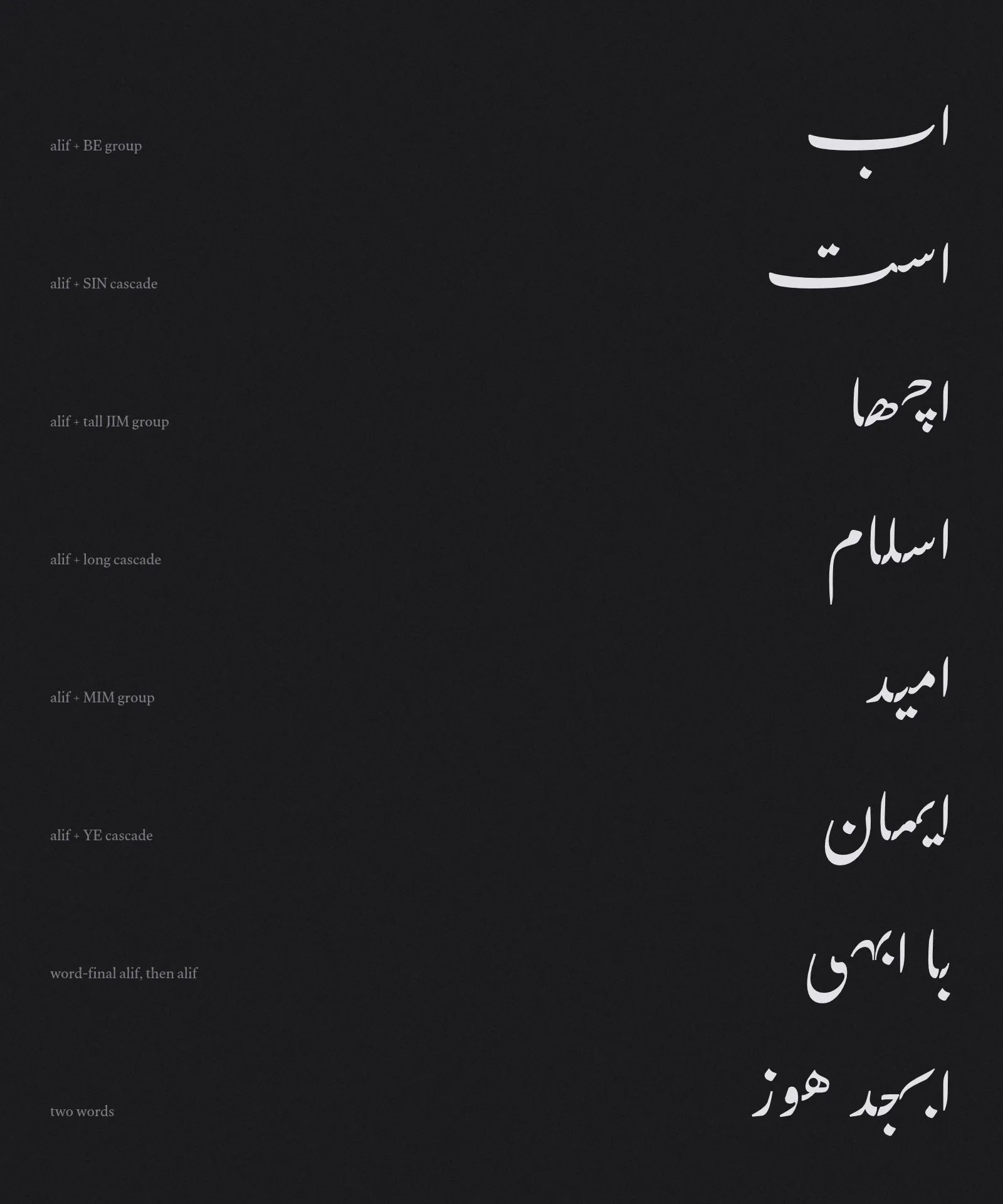
For the record, the full before and after test sheets:
Next
- Rename the family from Gulzar to Golshan and update the metadata.
- Review the raised alif against manuscript models and tune the anchor heights.
- Design the first reading-primer specimens: large letters, short words, full vocalization.