Virtua Grotesk:
Grid Systems for
Dataset Engineering
This is a draft until the model is on Hugging Face.
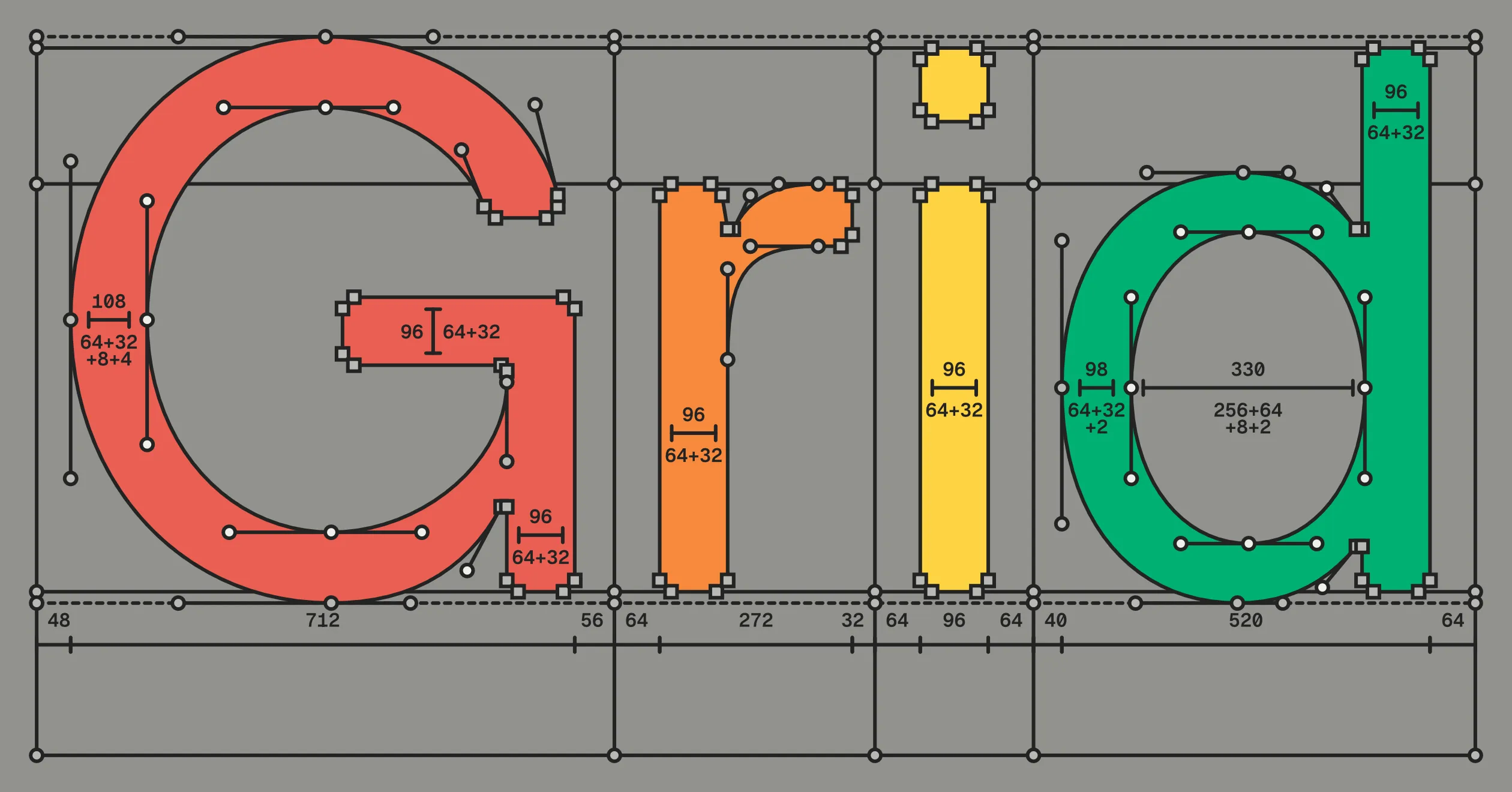
Virtua Grotesk is a typeface drawn on a dyadic self-labeling grid system: nested grids built on powers of two. Point placement defaults to an 8-unit grid, with small optical corrections dropping to a 2-unit subgrid. The grids record most of the drawing intent automatically, so the source files are labeled training data without extra work. This system makes the project a machine-learning and data-engineering project as much as a design project. If you are reading this on elih.net, you are reading Virtua Grotesk.
A small language model, Virtua-12M-v0.1, is learning to draw using this grid system. It will soon be on Hugging Face as an open-weight release that runs locally and can be fine-tuned. The font sources and harness are already on GitHub. Virtua Grotesk is free and open-source under the SIL Open Font License (OFL) v1.1.
Section Index
01. The Modernist Impulse
Designing the system instead of the final object is an old modernist impulse. Karl Gerstner argued for it in his 1964 book Designing Programmes, a foundational text of systematic Swiss design. In practice, the idea ran into limits. Computers were procedural, and strict rules made type stiff. They missed the optical corrections the eye needs.
Neural networks might change that. A neural network is not a procedural program; it interpolates and tolerates nuance where a rule is brittle. It also answers a modernist ideal that the rigid version betrayed: technology people can live in harmony with, not technology that extinguishes human dignity. The old impulse is worth another look.
Most fonts were never built as training data. Their coordinates land wherever the designer put them. Their contours are as individual as handwriting. That is fine for a rasterizer, but it is a problem for data engineers working with font sources. Many font AI/ML projects train on exactly this accidental data: scraped fonts and Google Fonts, heterogeneous in every dimension that matters.
A typeface is not a collection of characters drawn in isolation. It is many drawings that work as one system. Font datasets need the same discipline. A collection assembled without it is not training data capable of delivering useful models in 2026.
Modernist design was born a little more than a century ago out of similar frustrations in a similar time of technological change. I think the way forward is not a return to the dogma and rigidity of modernist design (the culture of design that replaced modernism is equally if not more dogmatic and rigid, just in different ways), but a rediscovery, with fresh eyes and new technology, of the loftier goals of early modernism that were unachievable with the technology of the previous century.
02. Replica and the Coarse Grid
The clearest precedent for Virtua Grotesk is LL Replica (Norm: Dimitri Bruni and Manuel Krebs; Lineto, 2008). Norm took the drawing grid in their font editor and made it ten times coarser. FontLab’s standard cap height is 700 units. Instead of 700 positions across it they had 70, a step of 10 units, and every node and Bézier control point had to land on one.
Two details make Replica more than a constraint exercise. First, the bevels: its corners are cut exactly one grid unit wide, so the grid is visible in the letterforms. Second, the cut diagonals: A, K, and R have no pointed apexes, so the letters can be set tight. The constraint produced the aesthetic, and the aesthetic advertises the constraint.
03. Dyadic Self-Labeling Grid Systems
Virtua Grotesk uses two related hierarchies. The grid hierarchy classifies point positions. The measurement hierarchy labels distances between points by popcount. Both use powers of two, but they record different parts of the drawing.
The coordinate space of a font is called the em, and its size is given in units per em (UPM). Virtua Grotesk uses 1024 UPM, or 2¹⁰, rather than the industry’s usual 1000. This is less exotic than it sounds. TrueType commonly uses a power-of-two em: 2048 is standard, and Inter uses it.
The first hierarchy is positional. Every point must land on the 2-unit grid. The 8-unit grid is the default for structural points. A point on the 2-unit grid but off the 8-unit grid records a fine optical correction. Large corrections can still land on the 8-unit grid, so grid membership records most, but not all, drawing intent.
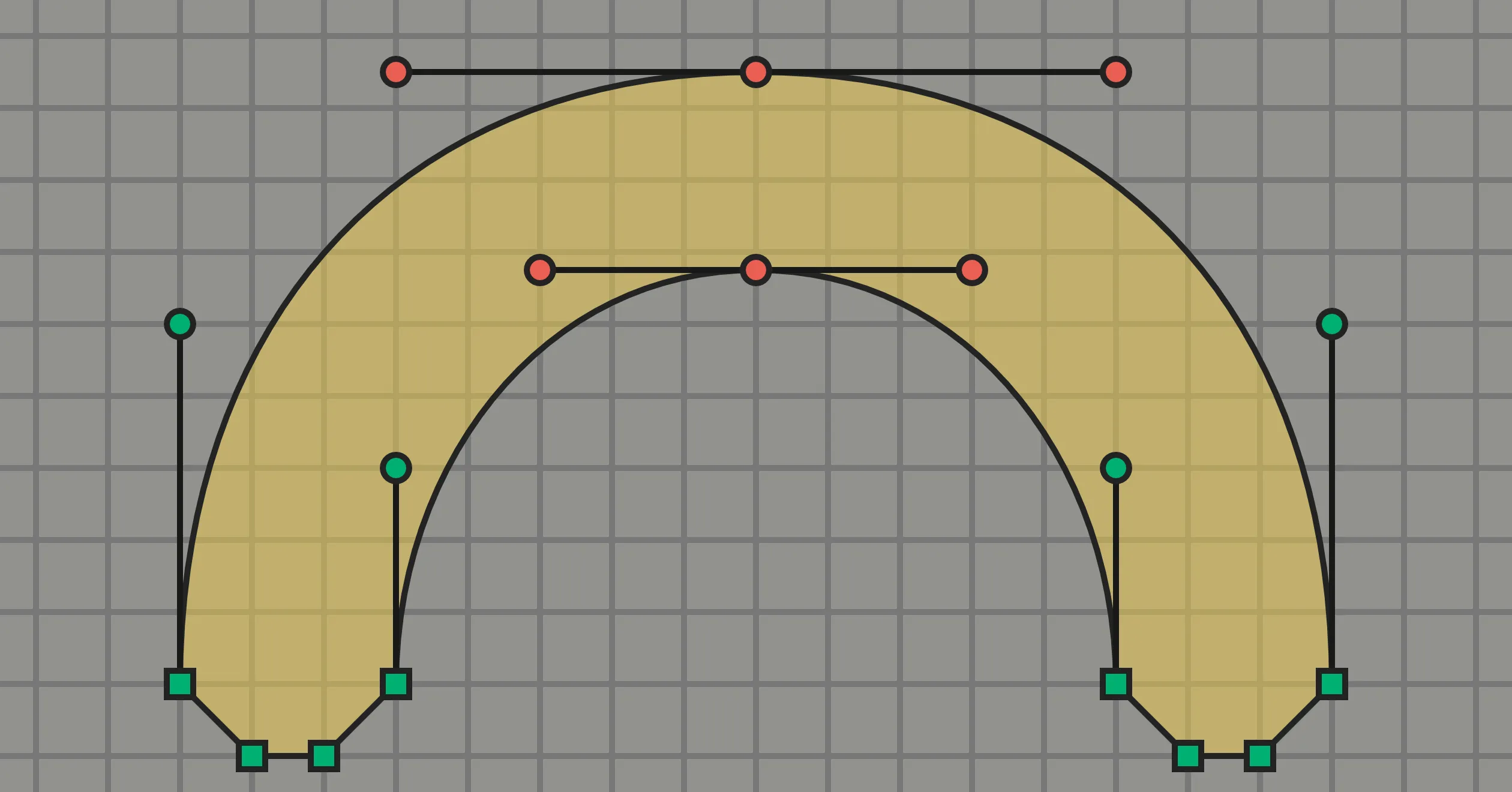
The second hierarchy describes measurements. Every integer has a unique binary decomposition: a sum of powers of two, each used once. The number of powers is its Hamming weight, or popcount. Virtua Grotesk uses popcount to label handle lengths and structural spans. A popcount of one is a pure power, such as 64, 128, or 256. Two is a short sum, such as 96 = 64 + 32. Three combines another increment, as in 104 = 64 + 32 + 8. Four or more uses a longer decomposition. The count is descriptive. A higher popcount often marks an optical adjustment or another fine detail. The value provides this label without additional annotation.
Popcount adds information that grid membership cannot. Both 96 and 112 are multiples of 8, but their decompositions record different design decisions. A 64-unit stem is too light and a 128-unit stem too heavy, so the Regular stem is 96 = 64 + 32. Where 96 is too light, the font uses 112 = 64 + 32 + 16. The additional term records a finer adjustment. Both measurements are valid.
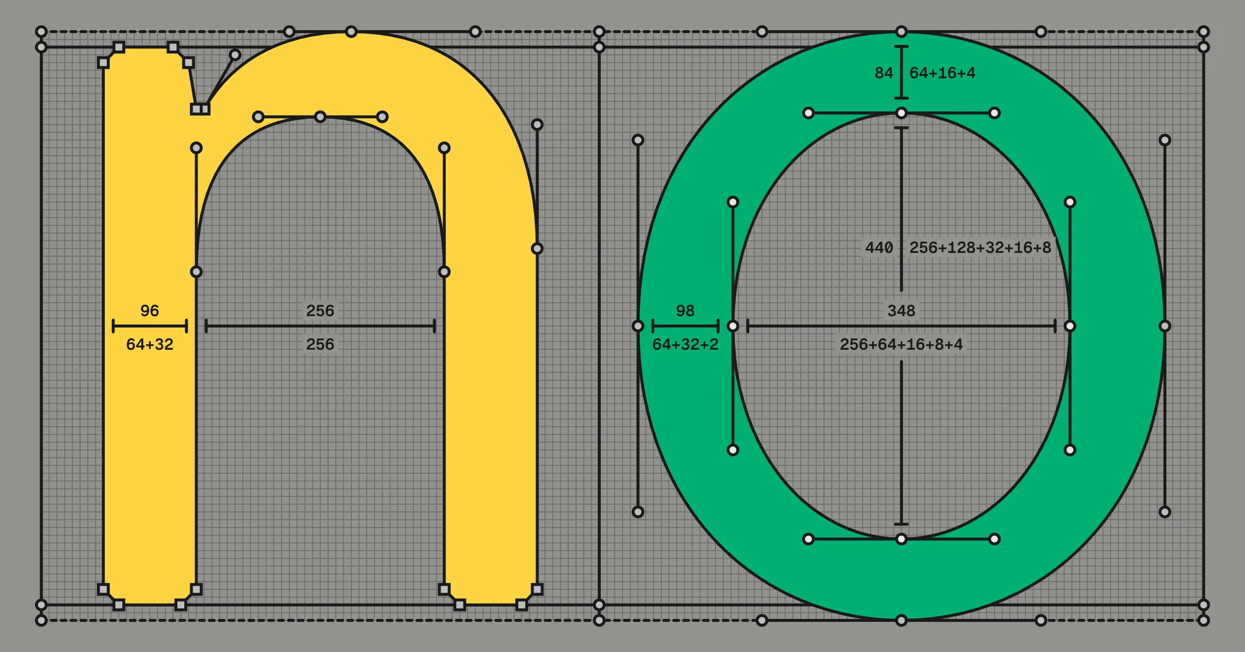
Runebender makes this hierarchy visible while I draw. It labels each measurement with its power-of-two decomposition and colors it by popcount: green for pure powers, yellow for two-power sums, orange for three, and red for values that use four or more. The colors identify the count. They do not indicate errors.
The coordinate rules and measurement labels live in
DESIGN.md
and are implemented programmatically. From the repo root, make grid-qa
runs a Python
script
that reports coordinate-grid compliance and labels measurements by
popcount. The AI agent harness uses that report to correct grid
violations, render the result, and run the script again.
The coordinate rules also apply to spacing. Sidebearings and kerning default to the 8-unit grid. Of Regular’s 84 kerning pairs, all but two sit on it. The two exceptions use the 2-unit grid for finer optical adjustment. The coarse default also gives the spacing a consistent rhythm: a small set of recurring intervals, tightened only where needed.
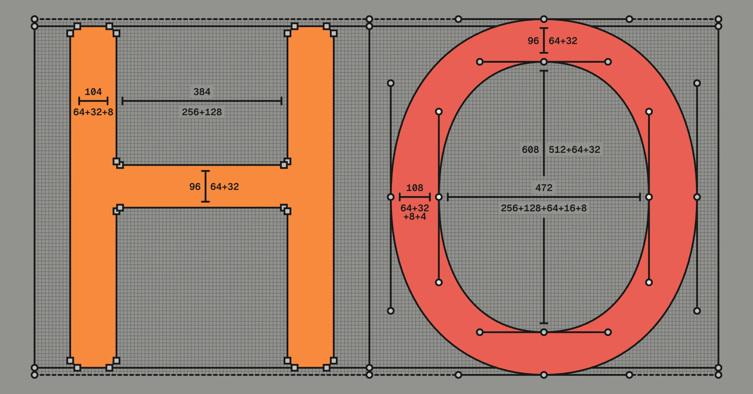
Together, the two hierarchies turn drawing conventions into data. Grid level exposes fine corrections. Popcount exposes where measurements become more specific. The defaults remain easy for tools to generate, while human adjustments remain visible for QA and later model training.
04. Aesthetic Discipline & Machine Legibility
Andrej Karpathy describes a large language model as a zip file of the internet. Billions of parameters compress terabytes of text into a smaller, lossy representation. He argues that models can become “very very small” if they no longer need to memorize the internet. He calls this smaller model a cognitive core: a model that keeps “the algorithms for thought” and retrieves the rest.
Virtua-12M-v0.1 has a narrow task. It does not learn the entire Google Fonts catalog. It learns the rules and grid of one design system. This limited scope supports a model with 12.54 million parameters and a 48 MB checkpoint.
Type designers already use compact representations. A variable font stores a base outline and interpolation deltas, then reconstructs each weight on demand. A neural network instead learns an internal representation of the design and can generate shapes that were not drawn explicitly. The grid helps in two ways:
- Consistency provides signal. The same stroke logic, chamfer sizes, and start-point conventions recur across the glyph set. The model can spend its capacity learning one design instead of reconciling different drawing habits.
- Constraints make outputs measurable. Every coordinate must be even, and the 8-unit grid establishes a structural default. Scripts can check these properties. The checks do not determine overall quality, but they provide objective feedback during evaluation.
The token encoding does not explicitly label the 8-unit grid. Every coordinate token represents a position on the 2-unit grid. All positions are available to the model, but the training data does not use them equally. If both coordinates were selected at random, a point would have a 6 percent chance of landing on the 8-unit grid. Points in the human-drawn sources land there 85 percent of the time. The grid is therefore implicit in the distribution of coordinates. When drawing held-out glyphs whose Bold outlines were excluded from training, Virtua-12M-v0.1 places 68 percent of its points on the 8-unit grid.
The model also learns where corrections occur. When a source outline leaves the 8-unit grid, the model often leaves it at the corresponding point. The training data contains no explicit tier labels, and no auxiliary loss rewards them. They emerge from the coordinate statistics.
One caveat about where the win comes from. The model reads each coordinate as a single token and never sees its binary digits. Base two is therefore invisible at the token level. The model learns recurring values, nested grid tiers, and rare corrections against a regular background. A base-ten grid with the same regularity could provide similar statistical structure.
The power-of-two em provides a separate benefit. A 1000 UPM font could still use 96- and 192-unit stems and interpolate them cleanly because the arithmetic operates on the stem width, not the em. A 1024-unit em helps when a coordinate is divided by the em, as in rasterization. Section 09 covers this arithmetic.
05. Glyphs as Sentences
A glyph is already a sentence: an ordered list of drawing commands. Transformers predict sequences. I give the model each glyph in that form and train it to predict the next token.
Virtua Grotesk uses the UFO source format: one XML file per glyph, with each outline stored as an ordered set of points. A transformer reads a flat token sequence rather than an XML tree. A small codec converts each outline into a sequence of drawing commands and coordinates.
Virtua-12M-v0.1 uses a small vocabulary. Conditioning tokens set the
glyph name, Unicode codepoint, and weight. Four commands draw the
outline: MOVE, LINE, CURVE, and CLOSE. Each legal grid position
has its own token, so each coordinate occupies one token. Here is the
Regular numeral 2, exactly as the codec emits it:
BOS N_two U_0032 W400 ADV 592MOVE 48 0LINE 528 0LINE 544 16LINE 544 72LINE 528 88LINE 160 88LINE 152 96CURVE 152 136 232 216 356 276CURVE 492 342 560 422 560 552CURVE 560 676 494 784 304 784CURVE 150 784 48 680 48 524LINE 64 508LINE 136 508LINE 152 524CURVE 152 620 210 692 304 692CURVE 402 692 464 632 464 552CURVE 464 460 394 390 280 336CURVE 116 258 32 146 32 32LINE 32 16CLOSEEOSRead the sequence from top to bottom. BOS and EOS mark its
boundaries. N_two names the glyph, U_0032 gives its codepoint,
W400 gives its weight, and ADV 592 gives its advance width. The
remaining tokens describe the outline. MOVE begins a contour, LINE
adds a line segment, CURVE adds a cubic Bézier segment, and CLOSE
ends the contour. Each numeric value occupies one token.
The codec is reversible. It converts UFO glyphs into sequences for training and converts generated sequences back into editable UFO glyphs. The round trip is lossless when every coordinate lies on the token grid. Virtua Grotesk already meets that condition, so the codec does not need to snap its points. The exactness comes from using the same grid in the sources and the codec, not from the grid’s coarseness. A 1-unit grid would round-trip just as cleanly.
The model trains directly on source outlines. It needs no rasterization, image encoder, or diffusion process. Each glyph uses about 90 tokens. Quantizing an existing font after the fact can discard coordinate precision. Designing on the grid makes each coordinate part of the source.
Representing vector drawings as sequences or code is not new. Prior systems include SVG-VAE, DeepSVG, DeepVecFont, IconShop, and StarVector. Their architectures range from sequential generators and hierarchical networks to raster-vector models and autoregressive transformers.
The difference here is the source data. Virtua Grotesk was designed on the same grid used by the tokenizer. Existing datasets often normalize or quantize fonts drawn under different conventions. Preprocessing can remove information, while mixed sources add variation unrelated to the target design. This project starts with one internally consistent typeface and asks how small the model can be.
Simon Cozens notes that “vectorization of glyph images has been historically very bad.” His own experiment with Google Fonts “completely failed.” These failures suggest that different approaches are needed. In the short term, I think the best results will come from high-quality font datasets designed from the ground up as training data, like what i am trying to do with this project.
06. A Small Model Learns to Draw
Virtua-12M-v0.1 is a 12M-parameter decoder-only transformer trained from scratch on one machine. It does not require cloud compute or a GPU cluster. The model has two implementations: an MLX build for an M4 Mac and a PyTorch build for a Linux PC with a gaming GPU. Training has since moved to the Linux box, an eight-year-old card with 8 GB of memory, which runs a training step in about a sixteenth of a second and finishes a full run in twenty minutes rather than an afternoon. Both builds are held to producing identical output, checked by a script that loads one set of weights into each and compares them, because everything downstream still runs on the Mac.
The model card:
| Virtua-12M-v0.1 | |
|---|---|
| architecture | decoder-only transformer: 6 layers, 384 dims, 8 heads |
| parameters | 12.54M |
| context | 1,368 tokens |
| vocabulary | 1,784 tokens: commands, names, coordinates, deltas |
| pretraining | 28,770 Regular-Bold pairs traced from Google Fonts |
| fine-tuning | 50 human-graded Virtua Grotesk Bold pairs; 463 glyphs in the corpus |
| optimizer | AdamW, lr 3e-4, 200-step warmup, cosine decay, batch 24, dropout 0.1 |
| compute | v0.1 trained on one Apple M4 Pro laptop (MLX) in 3h20m; training now runs on a Linux PC with an RTX 2060 SUPER |
| checkpoint | 50 MB fp32 safetensors |
Decoder-only transformers use the same architecture as GPT. Each token becomes a vector. The model’s six layers use attention to combine each position with relevant earlier tokens. A final layer converts the result into probabilities for the next token. During training, the model adjusts its weights toward the correct next token across the glyph corpus. The resulting model captures the sequence patterns used to encode outlines.
The implementation follows Karpathy’s from-scratch projects: char-rnn, makemore, and microgpt. Each project trains a small model from scratch on one narrow corpus with a limited vocabulary. Microgpt uses 27 tokens: the lowercase alphabet and a newline. Virtua-12M-v0.1 applies the same approach to glyph outlines by predicting one drawing command at a time. Each training stage takes 45 minutes to two hours on an M4 Pro or a gaming GPU.
The model runs inside Runebender, a free and open source font editor I work on. Below, I sketch a lowercase e with a brush. Virtua-12M-v0.1 redraws it in the font’s conventions using the green-graded glyphs in the sources as reference:
07. Weight Transfer as Delta Prediction
For most variable fonts every glyph drawn once must be drawn again heavier, with the same structure. Given the Regular, the model draws the Bold. The goal is a workflow where a designer draws a few control glyphs by hand and the model bootstraps the rest, corrected on the grid system.
The approach is delta prediction: rather than generate a whole Bold glyph at once, the model predicts, one point at a time, the offset from each Regular point to its Bold, the delta. Each delta is a small, bounded move rather than an open-ended shape, and that is what lets a small model do the job.
It is starting to work, and will get there in a few more training runs. To check it, ten glyphs were held out, their Bolds never shown to the model. The bar is a no-model baseline: take each Regular and shift it by the average Regular-to-Bold change. On every metric in the table below, Virtua-12M-v0.1 beats that baseline. (MAE is average coordinate error, Chamfer scores the outline shape, IoU the overlap in filled ink.)
| predicting a held-out Bold | MAE ↓ | Chamfer ↓ | IoU ↑ |
|---|---|---|---|
| no-model baseline | 31.3 | 37.4 | 0.564 |
| Virtua-12M-v0.1 | 24.0 ± 1.6 | 22.4 ± 1.3 | 0.745 ± 0.016 |
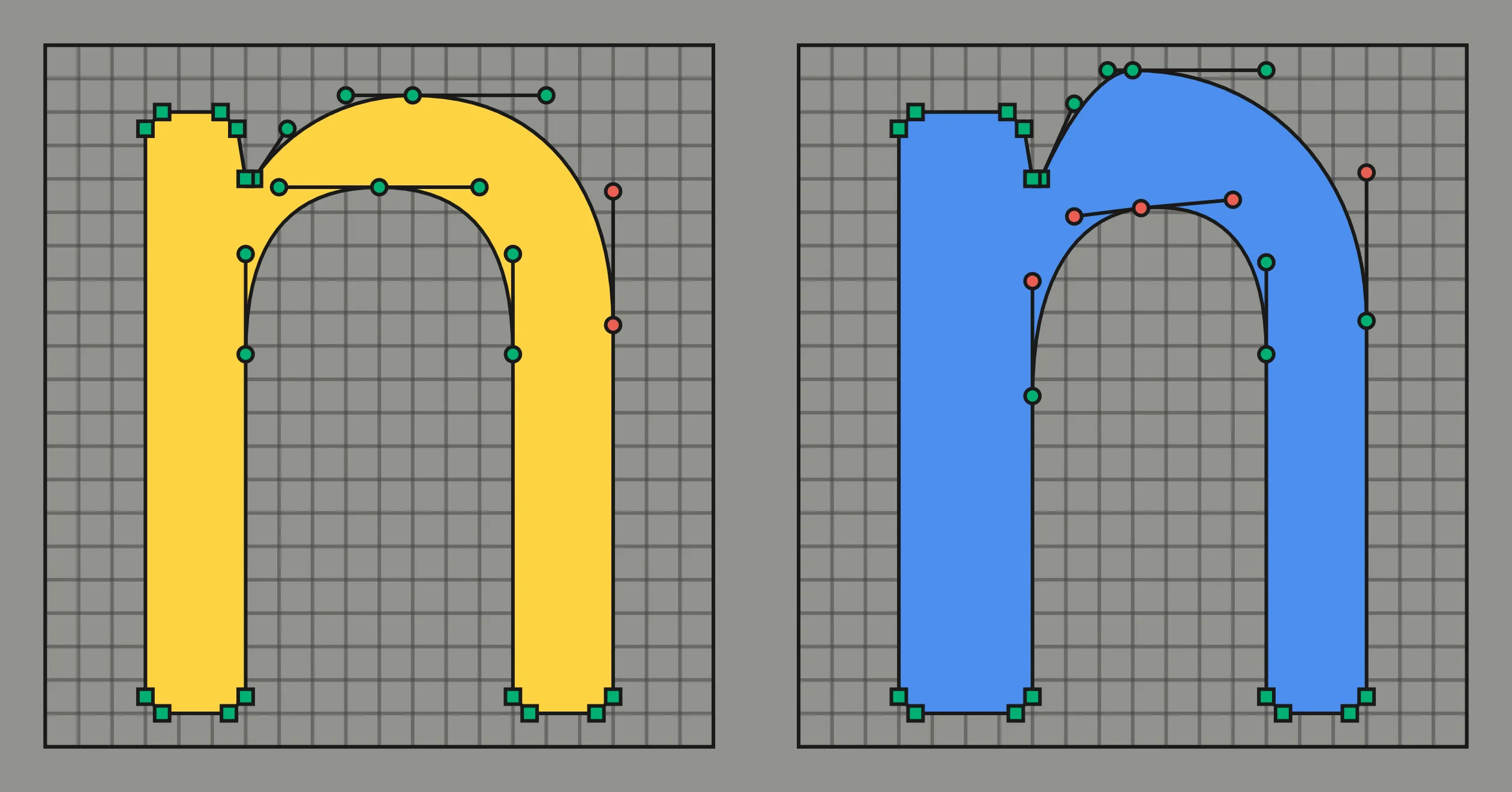
The output is a draft, not a finished Bold; a person still corrects it on the 2-unit grid. This is a small test, and the numbers will change as the work grows.
08. The Designspace Is a Data Factory
Two masters hold more data than they seem to: every interpolation between them is a real instance of the family, as Multiple Master fonts have done since 1991. The space between the masters is the synthetic data factory: pick a weight, interpolate, and snap the result to the grid.
An interpolation is not a master, but it is still clean, usable data. The sheet below shows the real “n” at Regular, the 1/2 interpolation, and Bold, points colored by grid level (green on the 8-unit structure grid, red on the 2-unit correction grid). The middle glyph was never drawn by hand, yet every point lands on the grid and its stem steps evenly through 96, 144, 192. It reads as a real glyph, not a degraded in-between, which is why the model can train on it.
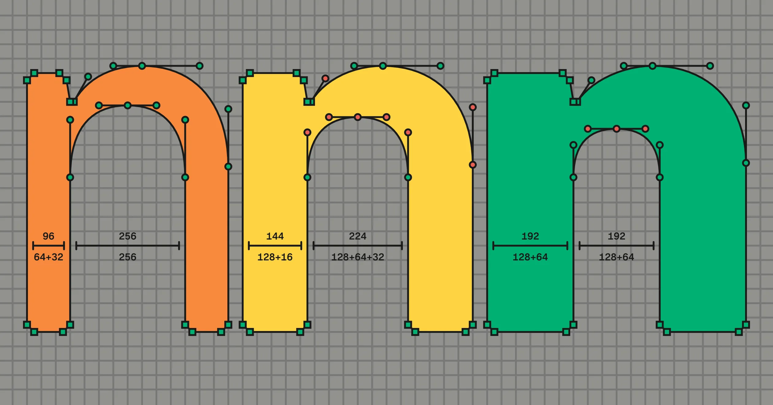
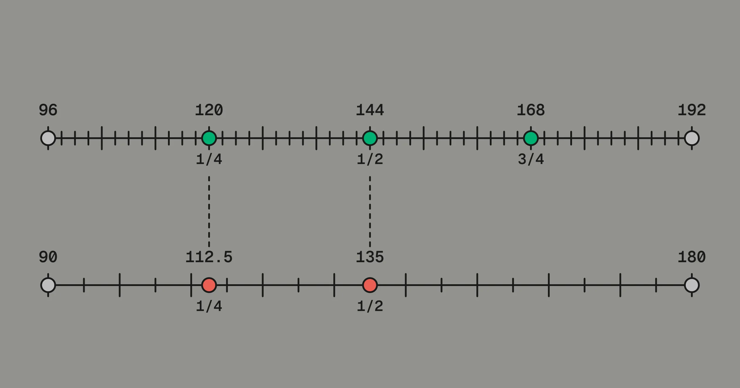
The reason is arithmetic: the stems differ by 96, which keeps splitting evenly as the weight halves, so every interpolated stem lands back on the grid. The glyph between the masters sits on the grid as cleanly as the masters do. Coordinates such as 90 and 180 do not close this way (below).
Interpolation gives volume, not variety: every batch is one design. Variety takes more families, which img2bez provides: a Rust autotracer that puts any raster (a rendered font, a scan, an AI-drawn glyph) onto the dyadic grid, with img2ufo assembling a UFO. This is how v0.1’s pretraining data was made: OFL families traced onto the grid.
That pretraining is the part of v0.1 I would not repeat, for a reason
worth stating plainly. The OFL training outlines were extracted from
compiled font binaries, not from sources. Compiled fonts carry point
bloat and conversion artifacts: IBM Plex’s Arabic beh has 95 points
in the shipped binary against about 20 in the source it was built from.
Training on that teaches the model to draw dense, compiled-looking
outlines, which is the opposite of the goal. The whole point is clean
source files a person can edit.
The second problem is the one the grid was meant to solve. The OFL families from Google Fonts are a grab-bag of unrelated designs, and a model spends its capacity absorbing the accidents of a thousand different drawing conventions rather than learning one. Consistency is signal. Both problems point the same way, so the dataset is now original work on the dyadic self-labeling grid system only: Virtua Grotesk across weights first, then expanding to a Plantin-like oldstyle and other designs using the same grid system.
One more correction, about measurement rather than data. The first Regular-to-Bold result I recorded was a coordinate error of 20.9 against a baseline of 31.3, and it was a lucky draw. Running the same evaluation across five seeds gives 24.0 ± 1.6, which is the number in the table above. A single training run is an anecdote, and small models on small corpora vary enough that the difference between anecdote and result is the difference between a claim that survives and one that does not.
The goal is a general model that knows one method for converting shapes to outlines and nothing else, not confined to the neo-grotesk style, even to the point where it can be used for logos, icons, and other font-adjacent kinds of vector graphics.
That expansion has started with Arabic. Virtua now has 316 Arabic glyphs drawn in each of the two masters, and the model’s training set has roughly doubled as a result: 111 approved Regular-to-Bold pairs, of which about half are Arabic. The held-out glyph the model is scored on is an Arabic one. This is a script where the weight-transfer task is harder than in Latin, because a heavier Arabic letter is not the Latin move of thickening stems while holding the skeleton still, and it is the next real test of whether the method generalizes past the alphabet it was designed on.
This is the first step in what I see as a decade-long transformation of digital typography. The aim is fonts that are models, not tables of outlines, freed from the per-glyph boxes digital type inherited from metal. An outline font is a compression scheme for the Latin letter, one fixed shape reused everywhere, and it strains on other scripts: Arabic in its manuscript forms is one continuous, context-dependent stroke, and the current workaround uses thousands of glyphs and substitution rules to fake what a hand does in one motion. A post-OpenType generative font model draws each glyph in context. I think the first ones will be built on grid systems like this, and I hope to play a part in building that technology.
09. The Mathematics of 2ⁿ
“TeX represents all dimensions internally as an integer multiple of the tiny units called sp. Since the wavelength of visible light is approximately 100 sp, rounding errors of a few sp make no difference to the eye. However, TeX does all of its arithmetic very carefully so that identical results will be obtained on different computers.”
—Donald Knuth, The TeXbook, 1984. The sp is the scaled point, TeX’s atomic unit of distance: 65,536 sp = 2¹⁶ sp = 1 printer’s point.
“every good outcome I’ve seen has been from finding a secret and doubling, tripling down on it in a way that compounds over time. not necessary that it even remains a secret because nobody ever believes you anyways”
—roon (@tszzl), 2026.
Readers of an early draft of this post pushed back on the powers-of-two focus. The narrow objection is correct: any grid shrinks the vocabulary, and a decimal grid tokenizes as cleanly as a binary one. I find no evidence that a neural network prefers one base to the other. The field usually quantizes coordinates to 256 positions, and that is because 256 values fit in one byte, not because networks work better in binary.
The strongest case for the industry standard 1000 is not arbitrary. It is PostScript’s coordinate system, and four decades of font software expect it as the default. It is also legible to the designer: on a 1000 em every coordinate reads as a percentage of the body, so a cap height of 700 is seventy percent, while on 1024 it is 0.684.
If the model were the whole pipeline, the objection would make sense: this project is basically trading the font industry’s default conventions for the ML field’s.
But the model is not the whole pipeline, and the rest of it imposes two constraints:
- Normalize exactly. Dividing a coordinate by the em must give a number the machine holds exactly, and the design’s proportions (cap height, x-height) must land on whole coordinates. A fraction is exact only when its denominator is a power of two; everything else rounds.
- Close under the operations. Halving, subdividing, and interpolating at the weights the format can store must land back on the grid. Exactness lasts only until an operation produces a point off the grid, and the pipeline interpolates and subdivides constantly.
1. Normalize exactly. Virtua Grotesk’s 96-unit stem over its 1024 em is 0.09375, exact. Over 1000 it is 0.096, which has no finite binary form, so the machine holds 0.09600000000000000200.
The clearest failure is the vertical metrics. Cap height and x-height are defined as fractions of the em. On 1024 they come out whole: 3/4 of the em is 768, and 9/16 is 576. On 1000, 9/16 is 562.5, and font coordinates must be whole numbers, so that x-height cannot exist; the designer settles for 562. The difference is that 1024 halves all the way down, ten times, while 1000 stops after three: 500, 250, 125.
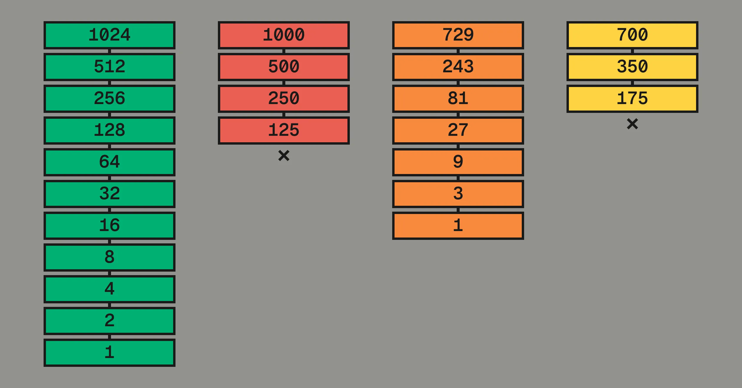
None of this is new. Knuth built TeX and METAFONT on binary fractions, and the OpenType spec notes that outline scaling “will be fastest” on a power-of-two em. Base two buys no thirds, but neither does ten.
2. Close under the operations. The numbers reachable from the integers by taking midpoints are exactly the dyadic rationals, and the midpoint is the pipeline’s own operation: interpolating halfway between masters is a midpoint, and bézier subdivision, which every rasterizer performs, is midpoints of midpoints. And a variable font stores an in-between weight as a count of 16,384ths: 16,384 is 2¹⁴, so every weight the format can store is a binary fraction. A weight exactly one-third of the way between masters falls between two marks; the format cannot write it.
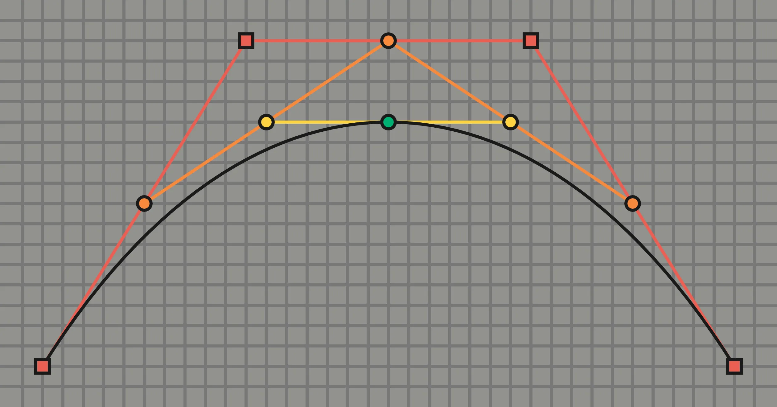
A midpoint of two multiples of 2ᵏ is a multiple of 2ᵏ⁻¹: each round drops one rung, and a ten-rung ladder absorbs the whole operation. A decimal grid fails at the second halving: 10, 5, 2.5.
Both constraints force the same grid: the dyadic ladder, 1024, 512, 256… down to 2, ten nested levels.
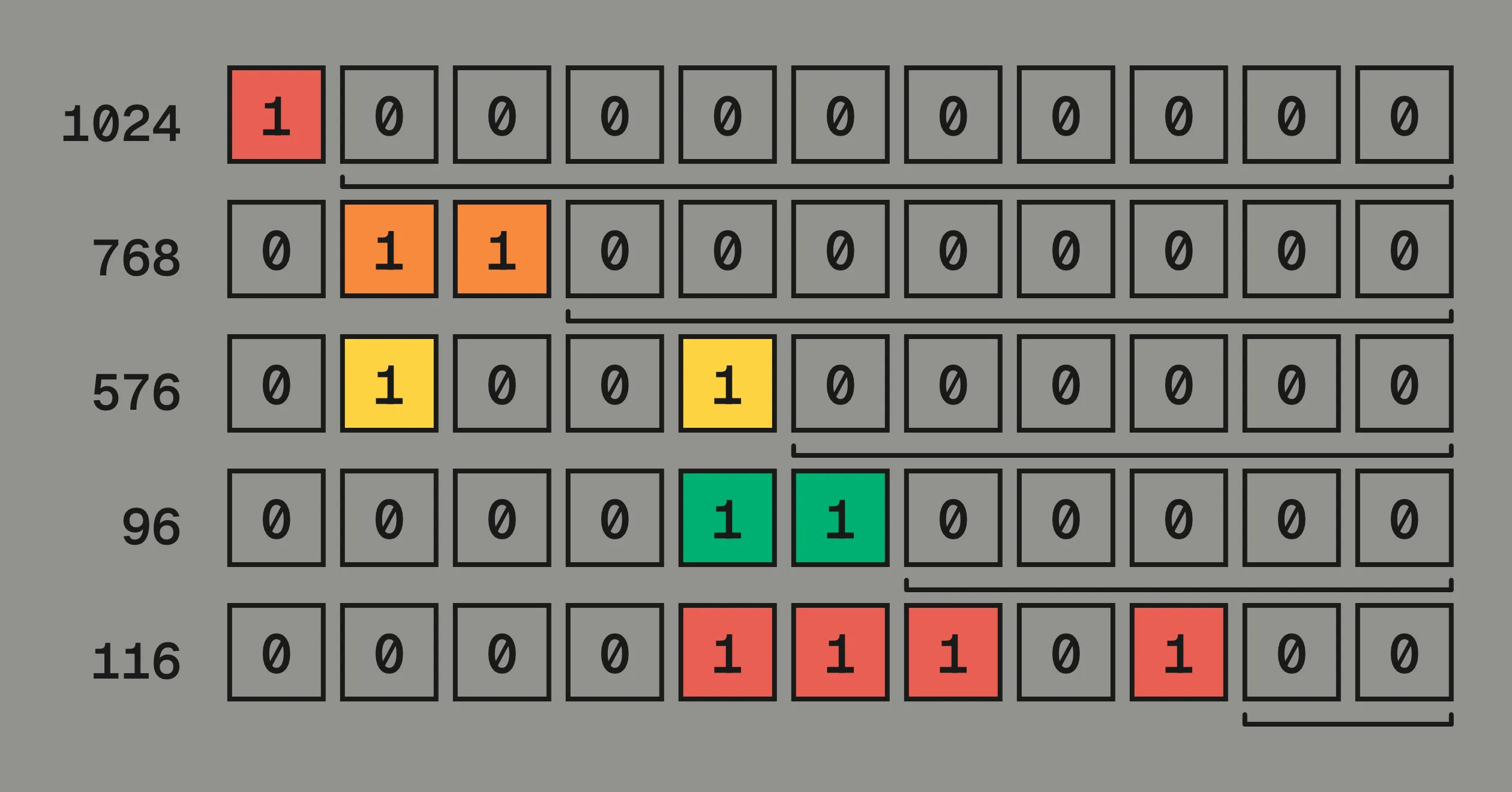
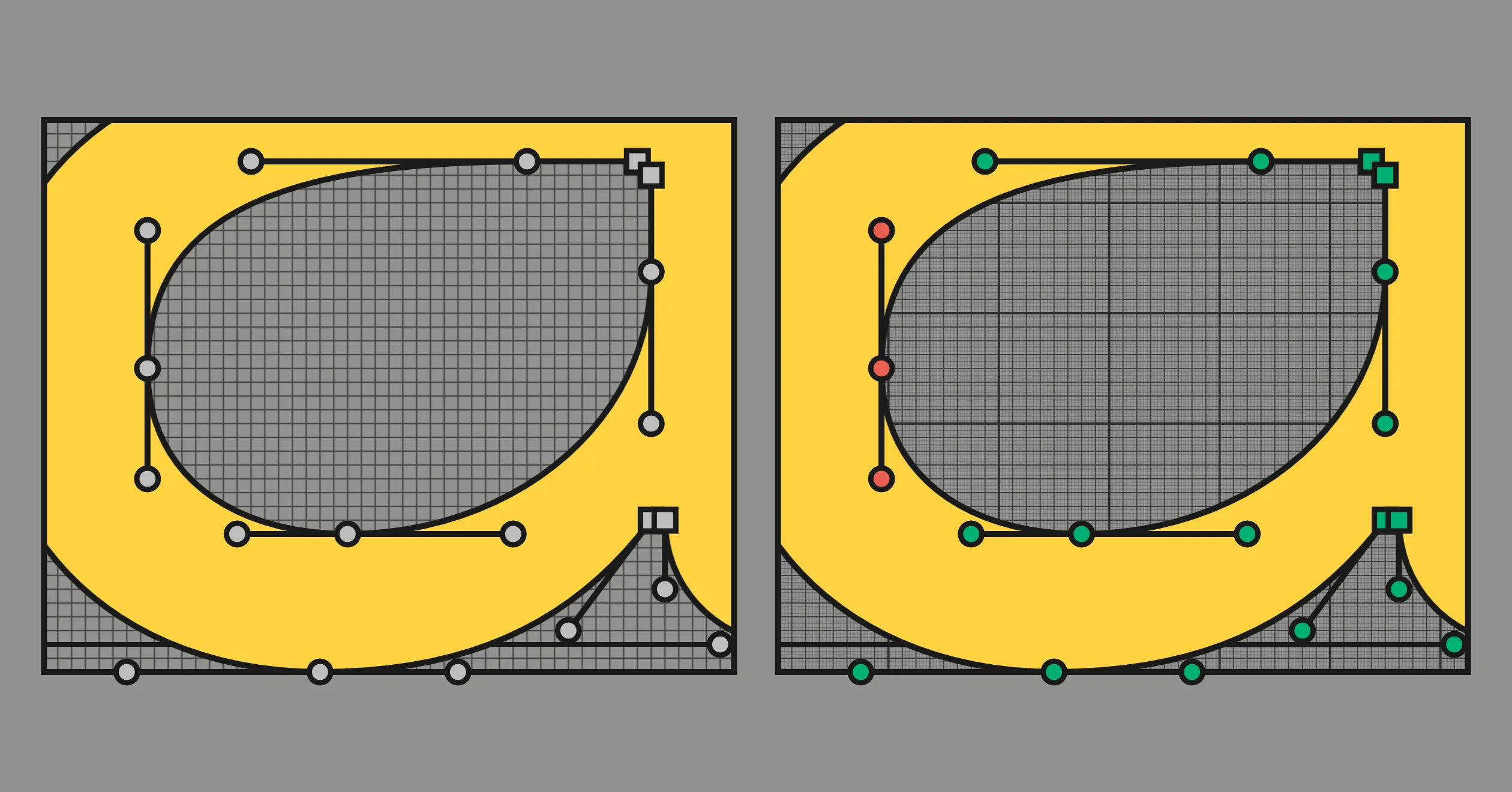
Write a coordinate in binary and its label is already there. 576 is 1001000000; the six zeros at the end mean it divides by 64. 116 is 1110100; the two zeros mean it divides by 4 but not 8. The label costs nothing to store because it is part of the number. The first figure below brackets these trailing zeros for the design’s key values. The second shows the labels on the lowercase a, structural points green, corrections red.
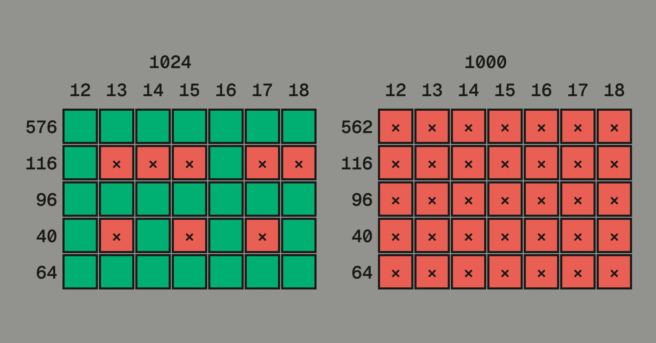
The grid levels are not just labels for the model: the rasterizer’s own arithmetic respects the same tiers. A rasterizer maps a coordinate to pixels by multiplying it by the pixel size and dividing by the em, on a grid of 1/64 of a pixel. On a 1024 em the device value of a coordinate c at pixel size p, in sixty-fourths, is
an integer, no rounding, whenever the trailing zeros of the coordinate and the pixel size sum to four or more. The vertical metrics on the 64-grid never round at any pixel size. The 8-grid structure is exact at every even size. The 2-grid corrections dissolve into antialiasing first. At 16 pixels, the web’s default, every coordinate is exact. On a 1000 em the same value is an integer only when 125 divides the product.
The figure below runs this arithmetic for five values from the design at pixel sizes 12 through 18: the x-height 576, the a’s 116 correction, the 96 stem, the o’s left edge at 40, and the 64 metric step. Green cells are exact; a red × rounds. On the 1000 em every value rounds at every size (562 stands in for the x-height, 9/16 of 1000).
One more alignment is particular to this pipeline. Render a 1024-em glyph at 1024 pixels and one font unit is one pixel; the specimen at the top of this post is drawn that way. The image models feeding img2bez downsample by eight, so the 8-unit structure grid reappears as their 128 × 128 latent lattice. The design grid, the pixel grid, and the model’s grid are one lattice.
Now the rivals, each against the constraints.
Decimal, em 1000. Fails normalization (0.096, held forever wrong) and closure (10, 5, and stop).
Balanced ternary, em 729 = 3⁶. The strongest rival, Knuth’s favorite, and on ternary hardware it would win. On the hardware that exists, 1/3 has no finite binary form, and every constraint after the first collapses.
The rest. Ems like 720 and 2520, multiples of 60, divide cleanly by three and five, but a binary computer cannot hold 1/720 exactly. The golden section is built on φ, which is irrational: no ratio of whole numbers equals it, so golden proportions can only ever be approximated. Letting a neural network learn its own quantization (a VQ-VAE) gives a codebook no person can draw on, no rule can check, and no retraining leaves unchanged; the field is moving back to small fixed grids anyway. And dropping the grid entirely changes nothing: a 64-bit float is itself a power-of-two grid, just one nobody designed.
Given the two constraints, the grid system is forced: the dyadic ladder of a power-of-two em, unique up to the exponent. Practice fixes the exponent: four decades of digital type say roughly a thousand units per em is enough, and 1024 is the power of two that lands there. (2048 is also a good choice and I plan to experement with it as I continue to train small language models on font sources.)
For the model, this pays out twice. The synthetic data is noise-free: section 08’s factory is a + t * (b − a), and with masters on the 2-grid and binary-fraction weights every machine computes the identical corpus; on a decimal em, float error enters every coordinate, differently per machine, and the model learns the design plus the noise.
When the engineering is settled, the tiebreaker is aesthetics. Powers of two would deserve the job on beauty alone.