Nasta’liq Distilled:
Post-OpenType Neural Network Fonts
· Updated August 17
A previous post introduced the NeuralType (.ntf) font format. An .ntf font is a small neural network with a short header, not a system that emulates Gutenberg’s movable type with virtual metal rectangles containing predefined glyph shapes. The first .ntf font was square Kufic, a style that resembles low-resolution pixel art. That font was a simple test of the concept and was easy to dismiss as a toy tech demo. This post is the next step. It tries to prove that neural-network-based fonts can be a viable alternative to OpenType.
I distilled Gulzar, an OpenType Nasta’liq font, into a .ntf. The resulting 1.36-million-parameter neural font can reproduce much of Gulzar’s output, though it still fails on many unseen words. But unlike a font designed from the ground up for this format, it cannot yet treat a whole line as one composition. Try it in the interactive demo below. Type, copy, paste, or move the cursor with the arrow keys. Press space to separate joined letters. Click and drag to select several letters at once.
The model above has 1.36 million parameters. With 8-bit weights, the .ntf file is 1.38 MB. The NeuralType engine is written in Rust, compiled to WASM, and built with Linebender libraries. The demo does not use OpenType shaping at runtime. During training on an inexpensive local GPU, the model learned to reproduce the shaped output produced by Gulzar and HarfRust, a Rust port of the HarfBuzz text-shaping engine.
Why Nasta’liq
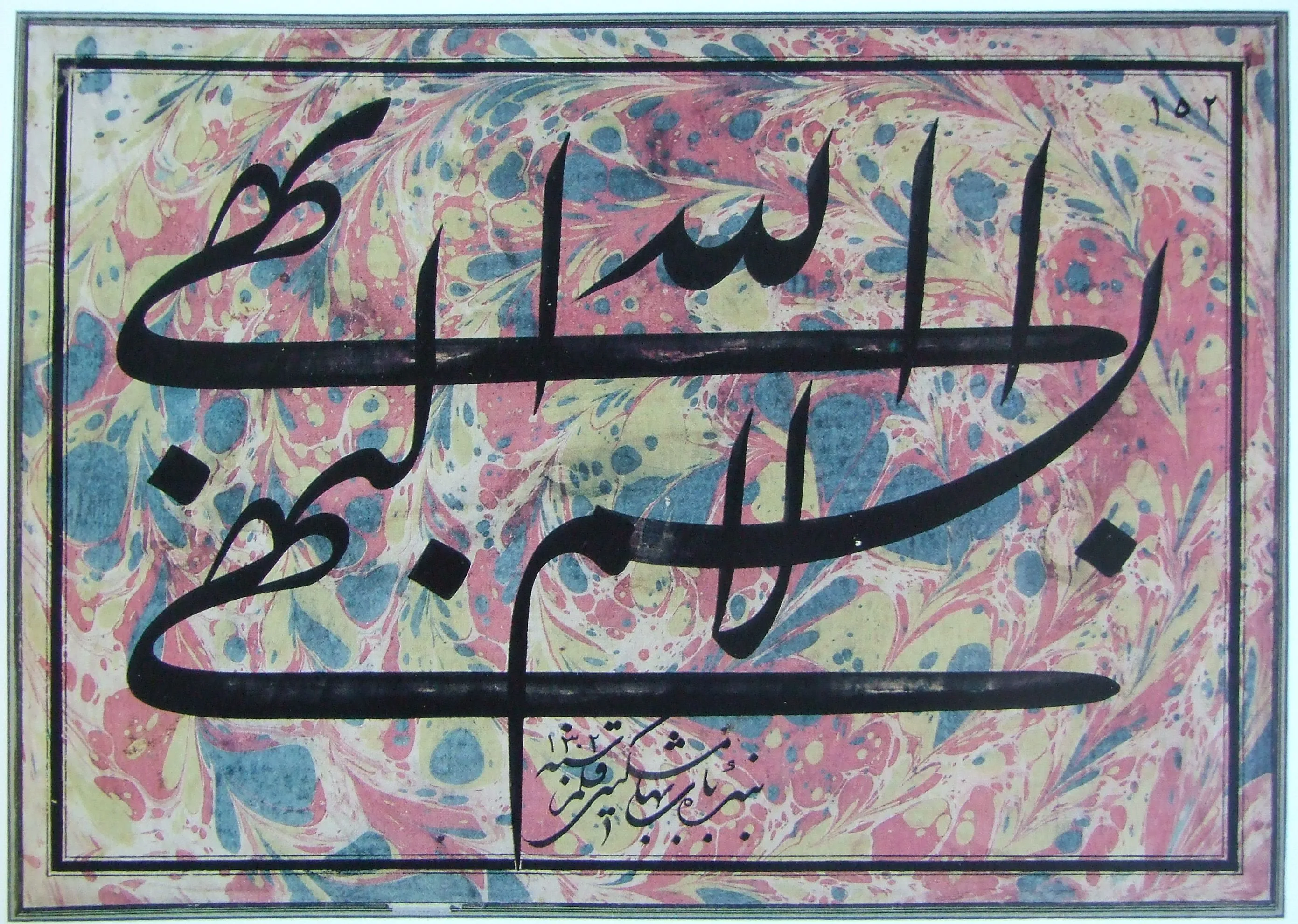
Calligraphy by Mishkín-Qalam (1826–1912). Public domain, via Wikimedia Commons.

Nasta’liq is a relatively nonlinear style of the Perso-Arabic script. Its traditional calligraphic compositions allow more freedom than many other styles. A calligrapher can stack words, extend strokes, and adjust the positions of letters and dots to balance black and white space.
The limits of OpenType fonts are easier to see when the same text is shown two ways. The next two figures place historical calligraphy beside the same text set in Gulzar. You do not need to read Nasta’liq to compare them. Just look at the forms and try to find differences between the two sides. Pay attention to the negative space between the forms.
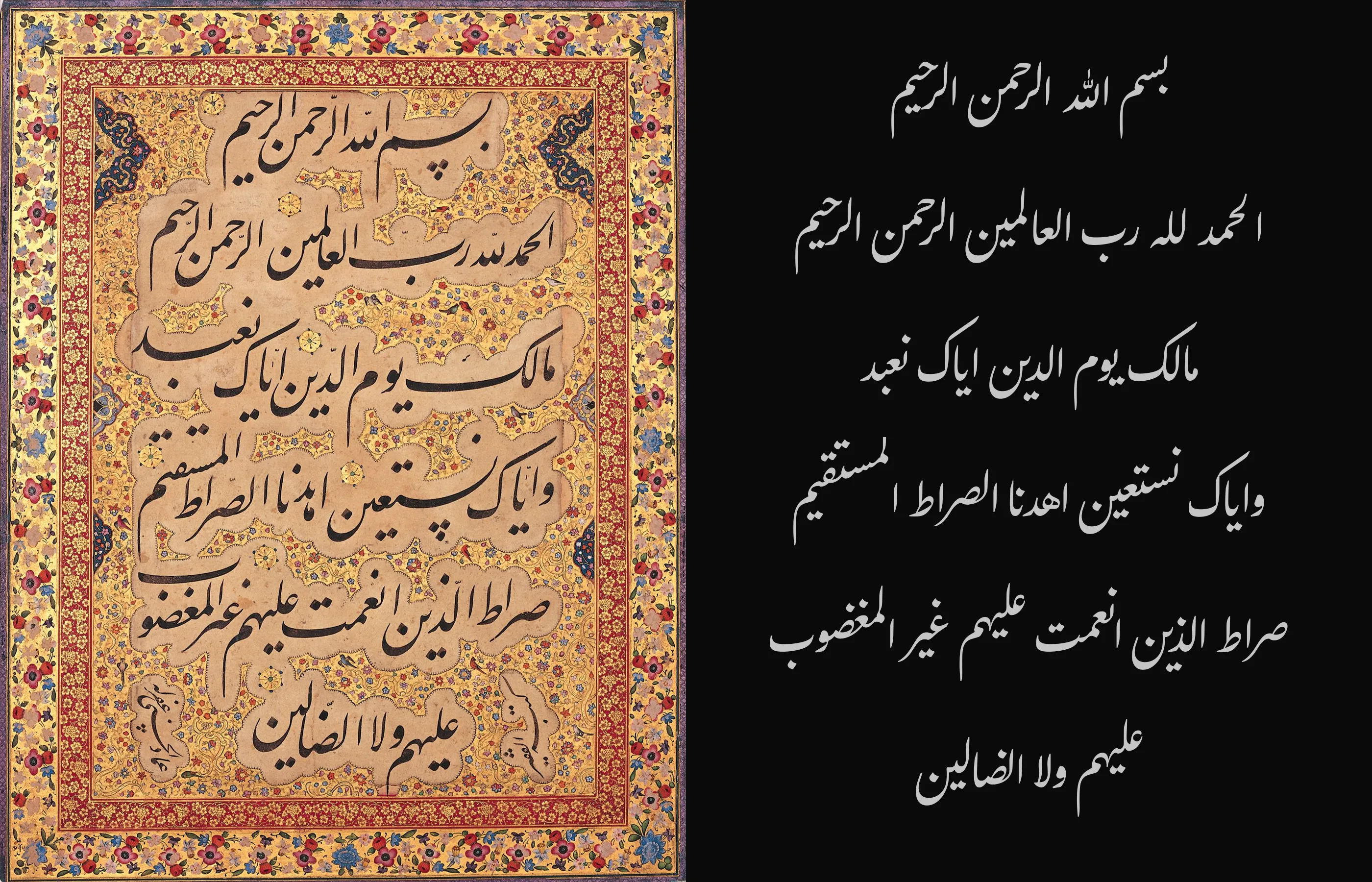
Left: Al-Fatiha in Nasta’liq by Mir Emad Hassani (1554–1615), National Museum of Iran. Public domain, via Wikimedia Commons. Right: the same text set in Gulzar.

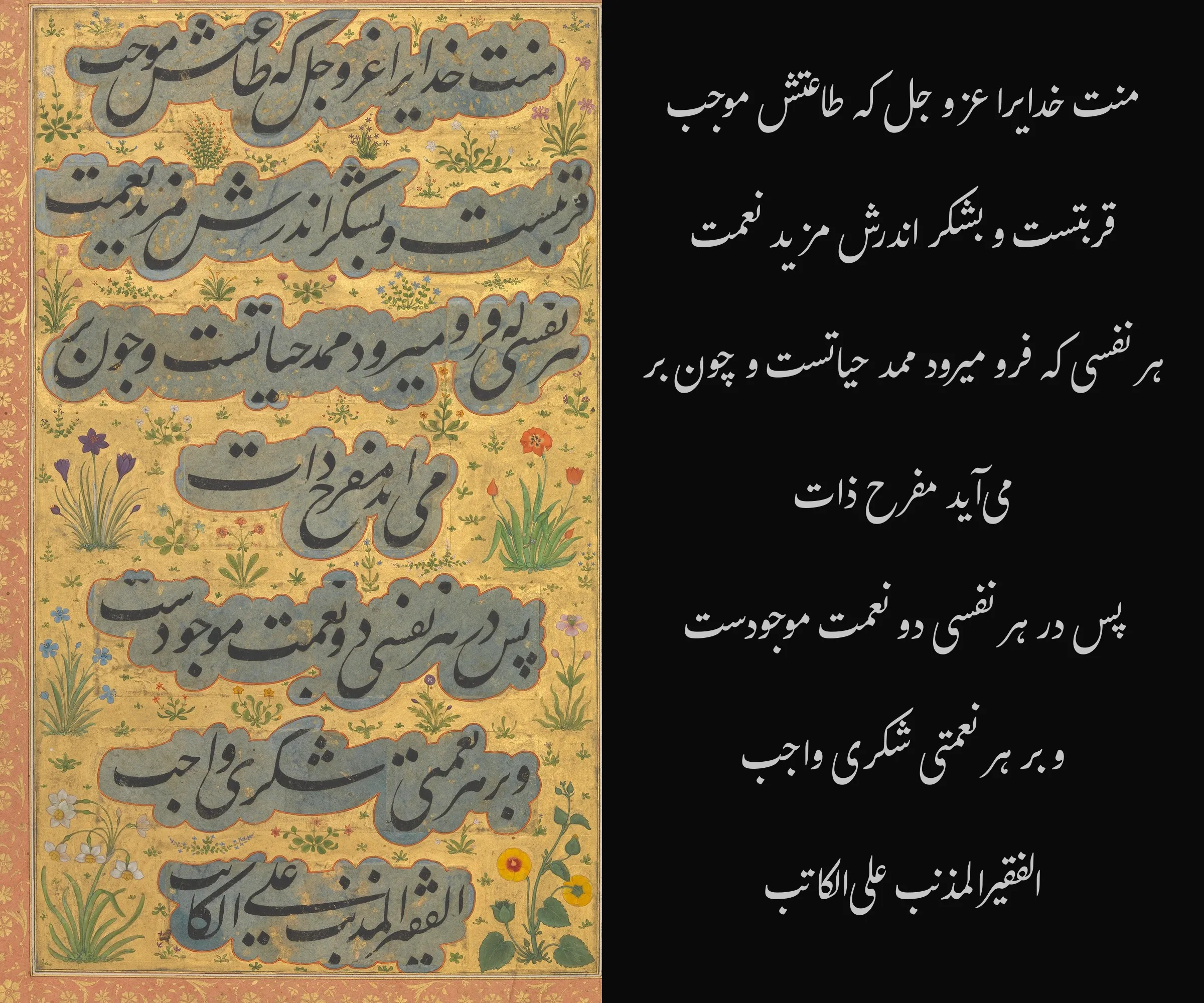
Left: the opening prose passage of the preface to Saadi’s Golestan. Calligraphy by Mir Ali Haravi (died ca. 1550), ca. 1530–50, from a folio in the Shah Jahan Album. Public domain, The Metropolitan Museum of Art, via Wikimedia Commons. Right: the same text set in Gulzar.

One short phrase shows how freeform and nonlinear Nasta’liq can be. The calligrapher separates, stacks, and repositions letters that follow one another in the text. This is an extreme example, but the compositions above use the same principles more subtly, moving letters and dots away from their expected positions to balance the composition and negative space.
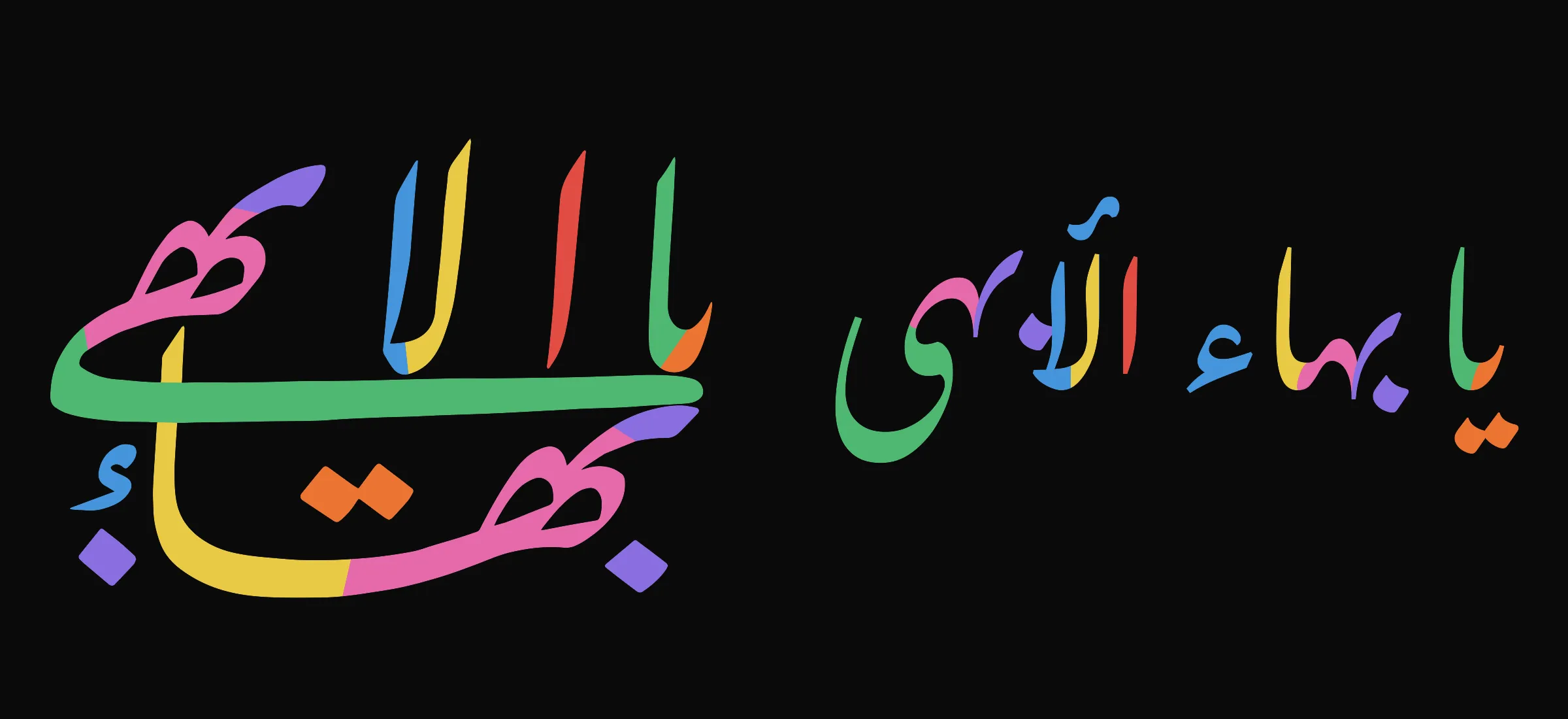
Left: Yá Bahá’u’l-Abhá, original calligraphy by Mishkín-Qalam (1826–1912). Color diagram by Любослов Езыкин, September–October 2015, CC BY-SA 4.0, via Wikimedia Commons. Right: the same text set in Gulzar.

An OpenType font could include this exact composition as a ligature glyph. A shaping engine could substitute it for the phrase while preserving the underlying text. But the font would contain only one finished design for one phrase. It would not learn how to compose other text. A neural-network-based font could learn a style and use it to make new compositions. A whole line or page could adjust to the available space. This is a goal for a future font designed from the ground up as a neural network. The distilled Gulzar model does not do this.
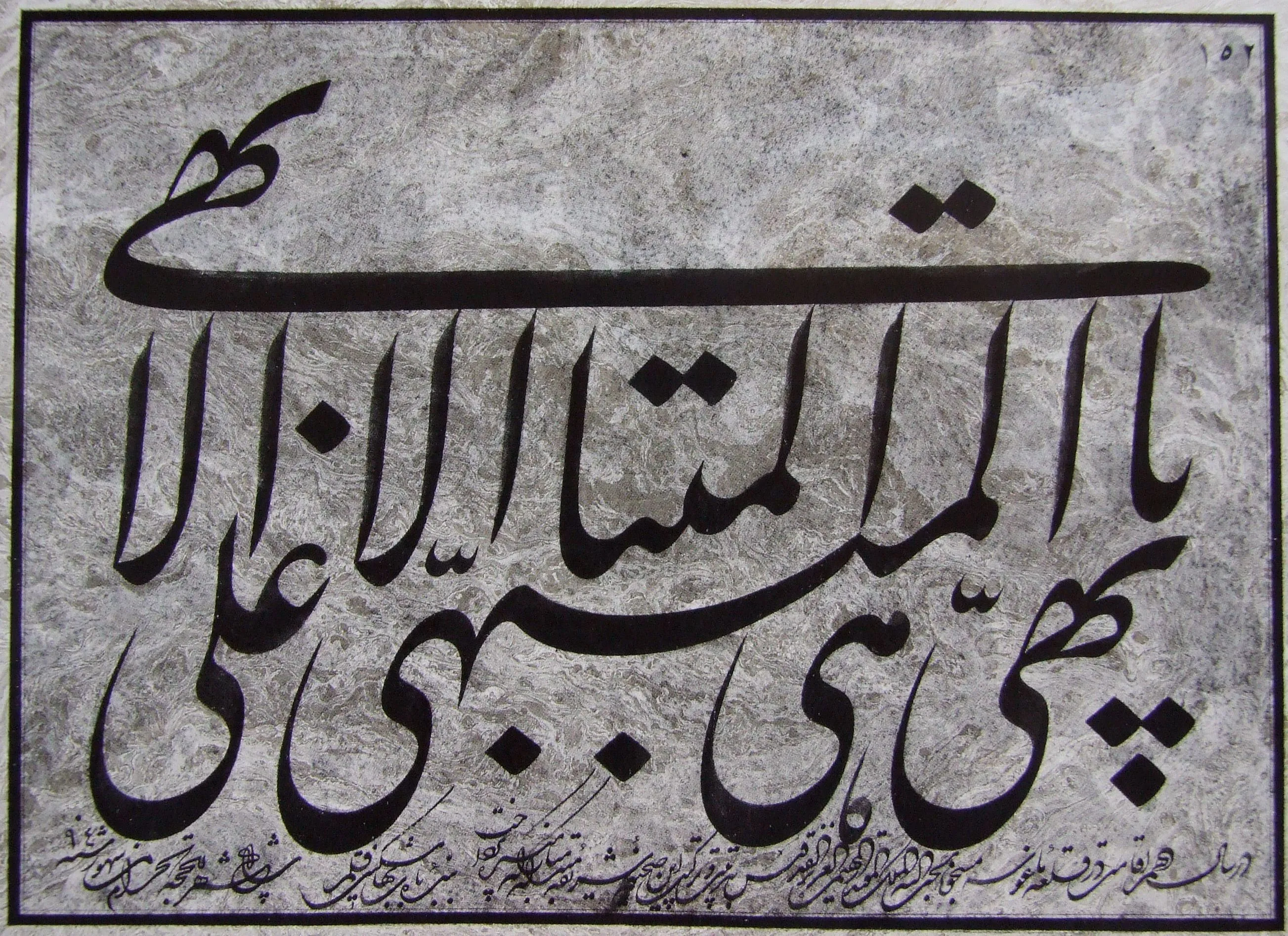
Calligraphy by Mishkín-Qalam (1826–1912). Public domain, via Wikimedia Commons.

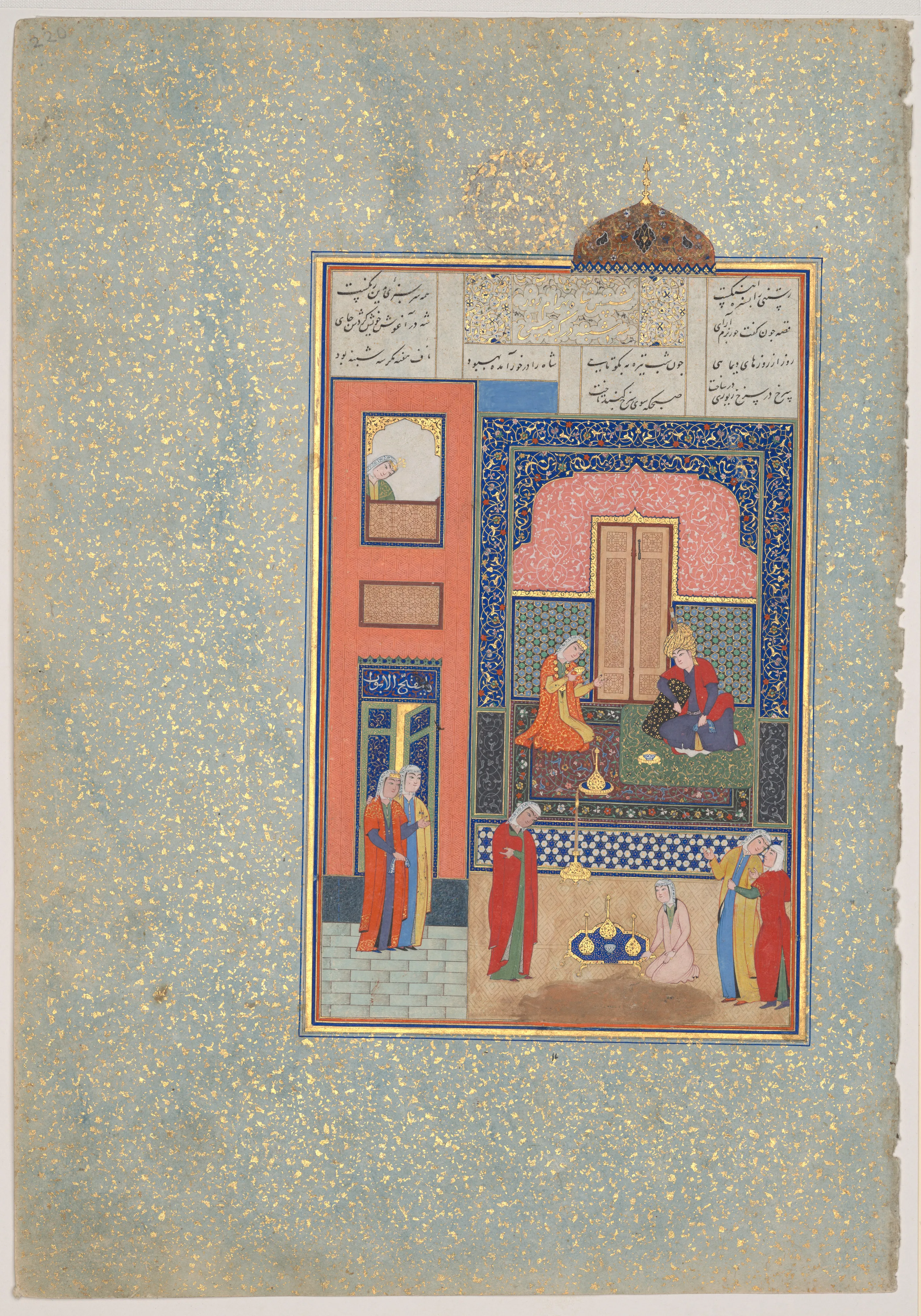
“Bahram Gur in the Red Palace on Tuesday,” folio 220 from Nizami’s Khamsa. Calligraphy by Sultan Muhammad Nur (ca. 1472–ca. 1536) and Mahmud Muzahib (ca. 1500–1560); painting by Shaikh Zada (active 1510–1550). Herat, 1524–25. Public domain, The Metropolitan Museum of Art, via Wikimedia Commons.
_of_Nizami_of_Ganja_MET_DP-22880-001.jpg)
Other Approaches
I used Gulzar because it is the best current OFL licensed Nasta’liq font I found whose shaping is implemented with OpenType Layout tables. The only comparable OpenType option I could verify is Noto Nastaliq Urdu, which is slightly worse in my view. Building a good Nasta’liq font with OpenType is expensive and time-consuming. The shortage of good OpenType Nasta’liq fonts, relative to the style’s cultural importance, suggests that this work is often uneconomical and out of reach for hobbyists.
Several systems handle Nasta’liq outside OpenType Layout. Awami Nastaliq uses Graphite, which supports more complex shaping rules. SIL’s older Nastaliq Navees relies on the obsolete QuickDraw GX system. DecoType’s Advanced Composition Engine powered Tasmeem, a proprietary InDesign extension for advanced Arabic composition. These systems define behavior through rules and require specialized software, which limits where they can be used.
Neural fonts take a different approach: they learn from examples. They also need engine support for now, but the long-term goal is not another specialist extension. It is a format that could replace OpenType, or at least gain broad support on the web and in graphics software. Beyond Nasta’liq, neural fonts could support new kinds of typography for branding, advertising, and cultural production, providing stronger economic incentives for adoption.
Measuring Gulzar
To distill Gulzar into a neural font, I first measured how much its output changes with context.
I shaped every possible two-letter sequence with Gulzar and HarfRust. For each first letter, I counted the distinct glyph IDs in the shaped output. Across the 31 letters, these contextual-variant counts total 344, or about 11 glyph IDs per letter on average. The same test gives 150 for Amiri, a Naskh font with rich contextual behavior.
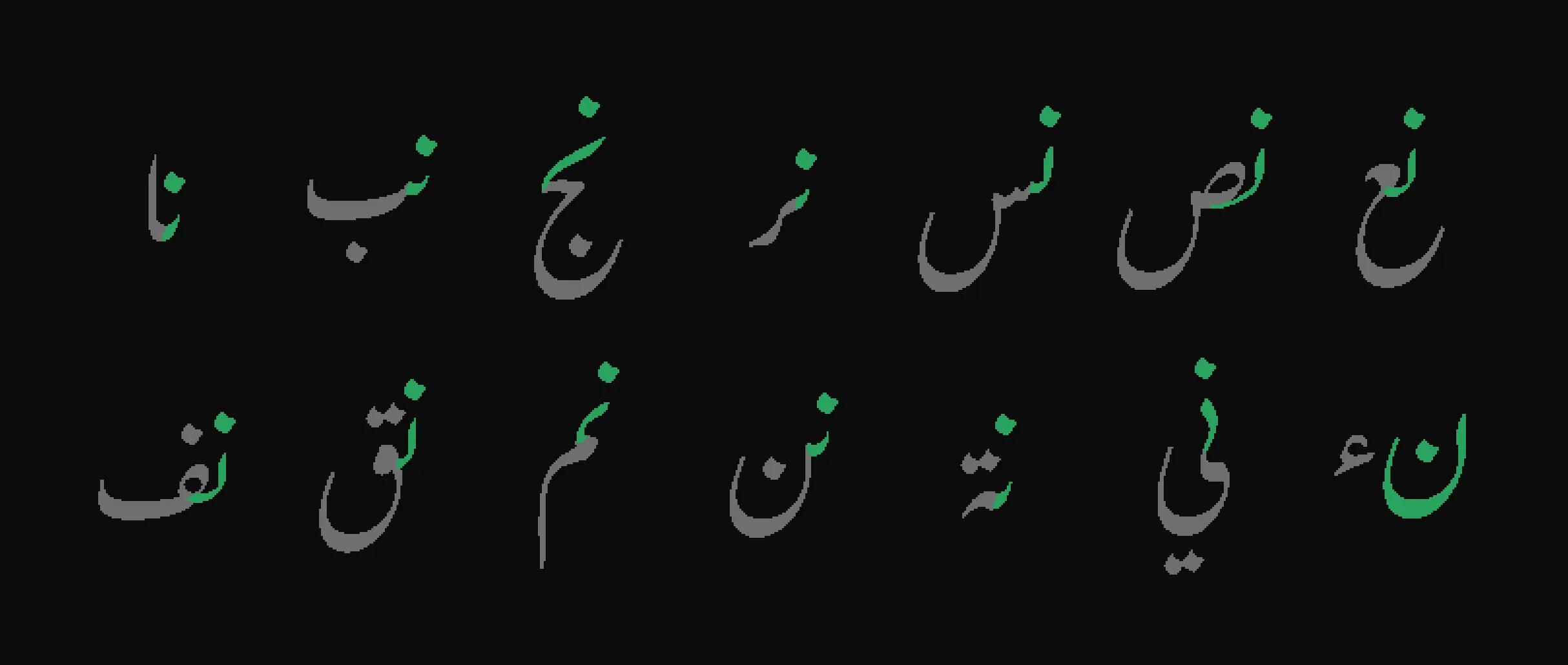
The figure below shows initial ن in green, with the following letter in gray. Each following letter produces a different initial form.
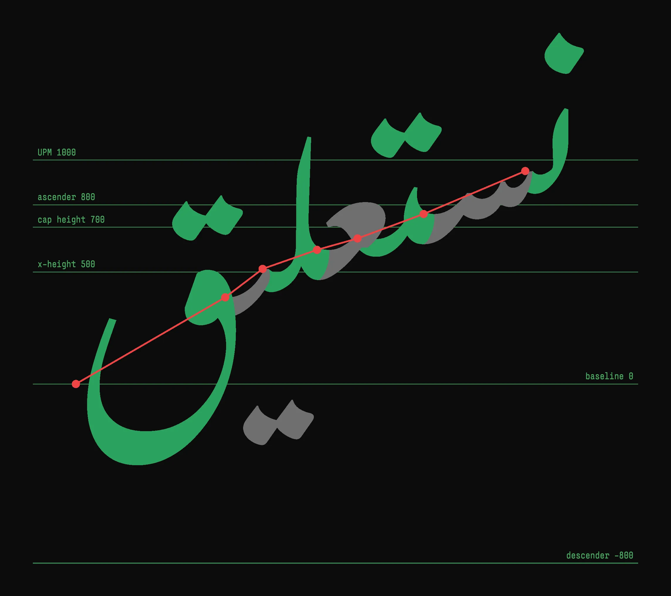
The figure below shows the vertical cascade in نستعليق. The letters alternate between green and gray. The red points mark the origins of the main letterforms, which span 0.95 em vertically.
Building the Dataset
The measurements above show what the dataset must capture: how Gulzar changes
shapes and positions with context. I wrote the
crates/neuraltype-distill
extraction tool to record this information. In model distillation, the existing
system that a new model learns to imitate is called the teacher. Here, Gulzar
and HarfRust together serve as the teacher.
The dataset includes every possible one, two, and three-letter string, 30,783 in all. Three letters are enough to capture initial, medial, and final forms. It also includes 24 longer words from the bismillah, the surahs Al-Fatiha and Al-Ikhlas, and the word نستعليق.
For each string, HarfRust uses its Arabic shaping logic and Gulzar’s OpenType Layout tables to select and position glyphs. It returns glyph IDs, horizontal advances, and x and y offsets. The extraction code records these values and reads the matching outlines from Gulzar. With the font and shaping options fixed, each input has one fixed output for the model to learn. This is a property of the teacher used here, not of neural fonts in general.
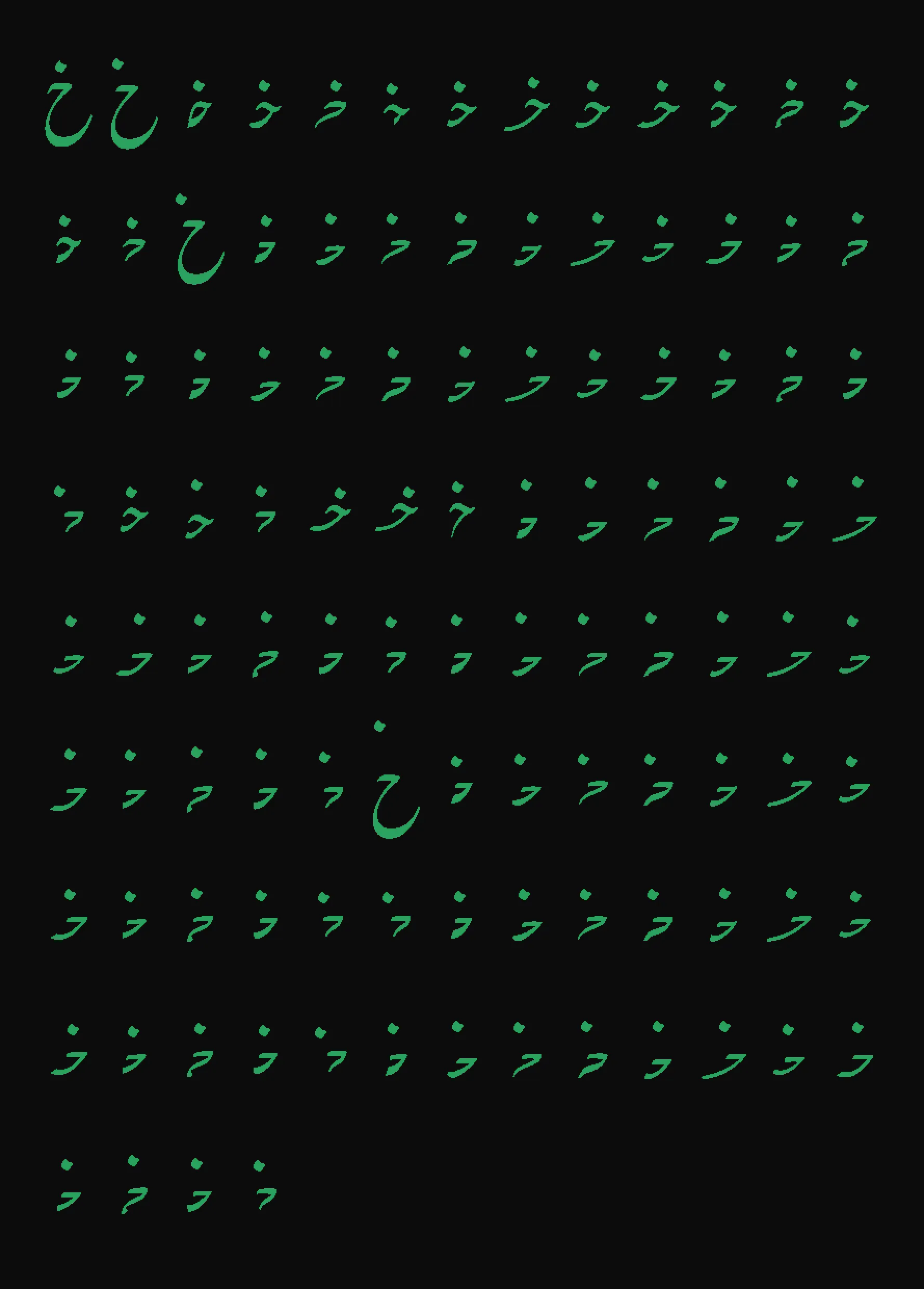
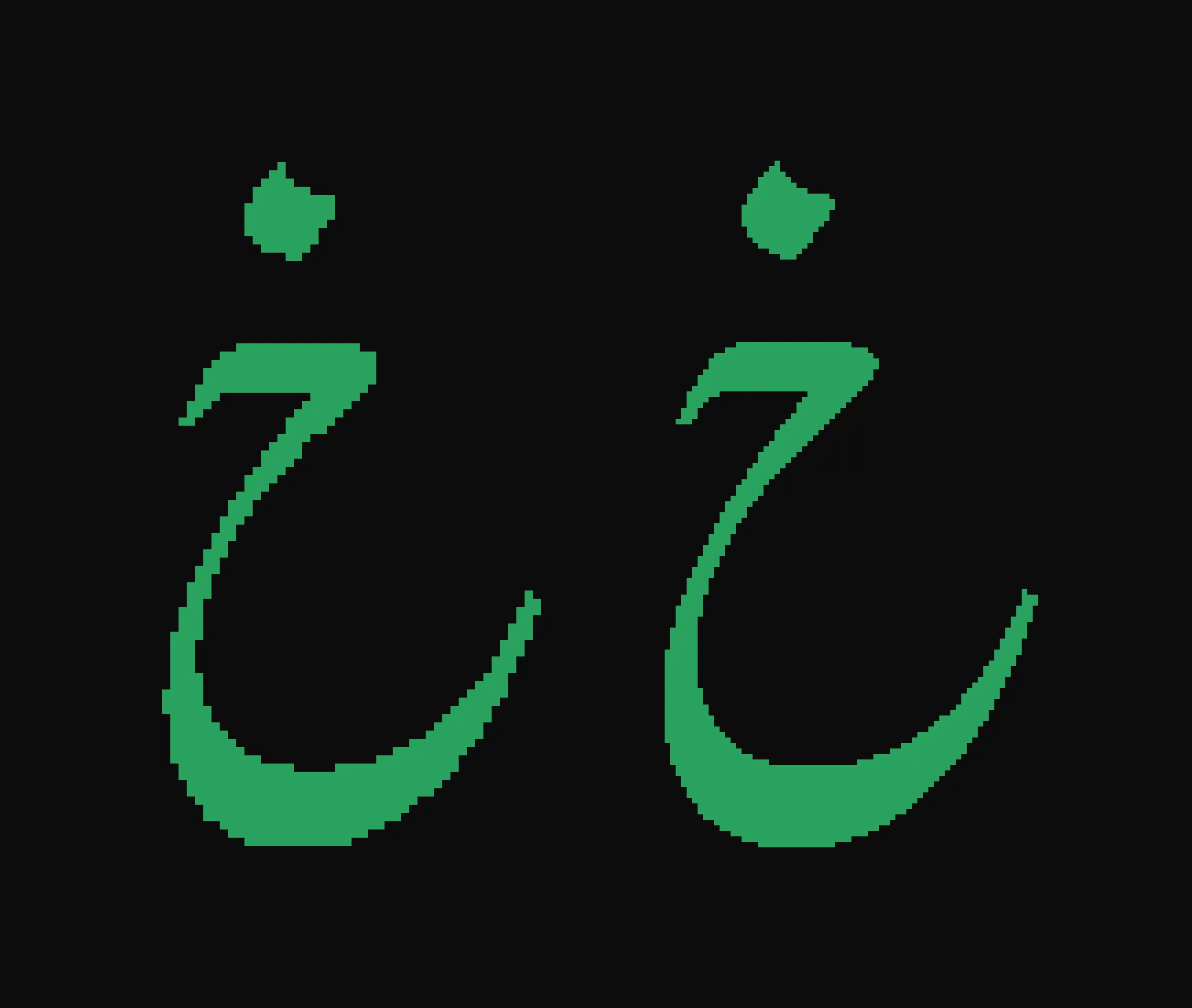
The dataset contains 91,390 examples. Each records a text context, shape, and position. Across the dataset there are 1,150 distinct shapes. The 108 shapes associated with خ are shown below.
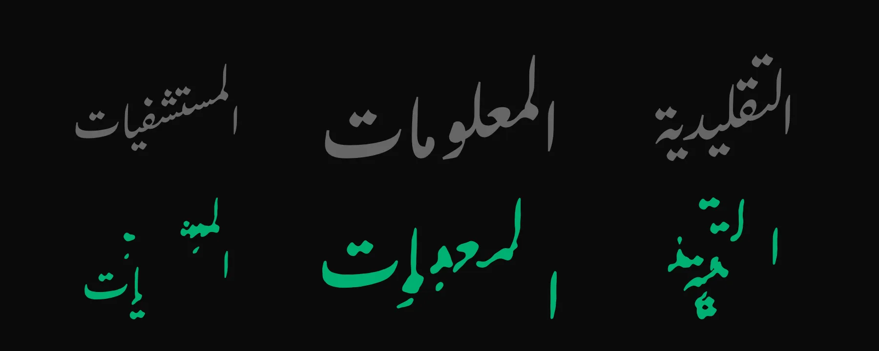
The dataset covers every short string but only 24 longer words. The model therefore fails on some unseen words. In the examples below, it breaks shapes and placement. Gulzar is gray; the model is green.
Exhaustive coverage stops at three letters for now. Four-letter strings alone would add 923,521 inputs, about 30 times the complete one-to-three-letter set. Five-letter strings would add another 28.6 million. Exhaustively listing longer strings quickly becomes impractical. A production model should instead train on representative text and add examples where its output differs from the teacher. Basic joining and mark-attachment rules, plus simpler fallback forms, could prevent invalid output. Producing valid output for unseen text is probably the hardest technical problem facing neural fonts.
Signed-Distance Fields
We convert each composed shape into a signed-distance field. This lets the model predict a grid of numbers instead of a sequence of Bézier drawing commands.
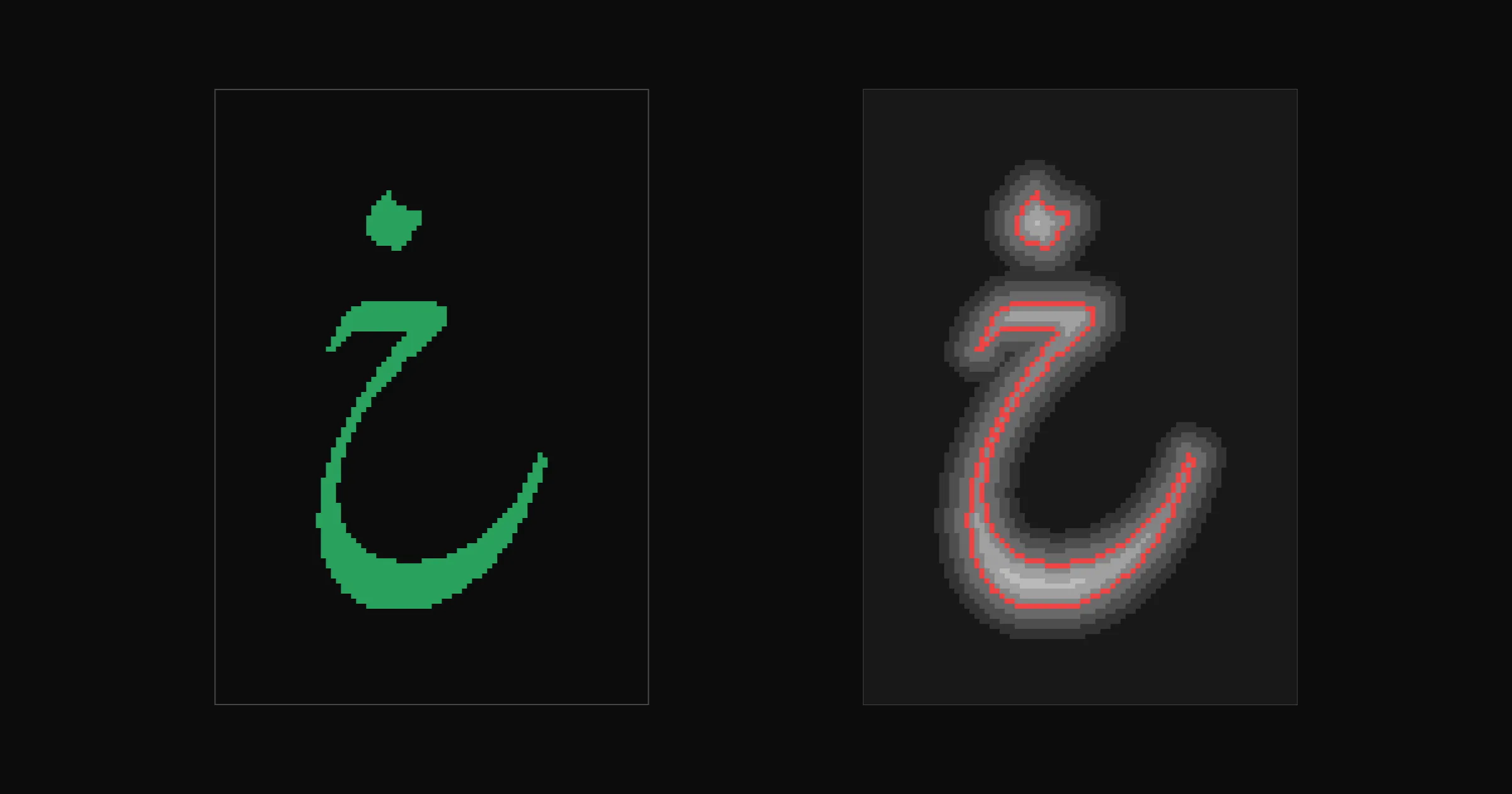
A grayscale rasterization records the coverage of each pixel. A signed-distance field instead records each cell’s distance to the nearest edge. Values are positive inside the shape and negative outside. The edge is where the values cross zero. These distances let us place the edge between grid cells.
The image below shows the isolated خ from the training set. On the left is the shape. On the right is its signed-distance field, with the zero contour in red. The model learns to reproduce this field.
This ability to preserve sharp edges at low resolution also made signed-distance fields useful in real-time graphics. A 2007 paper from Valve used them to render sharp vector graphics from low-resolution textures in the Source game engine.
The figure below follows one horizontal row through خ. The red line in the left panel marks the row. The middle panel plots its values. Each red dot marks a zero crossing where the row passes through an edge of the letter.
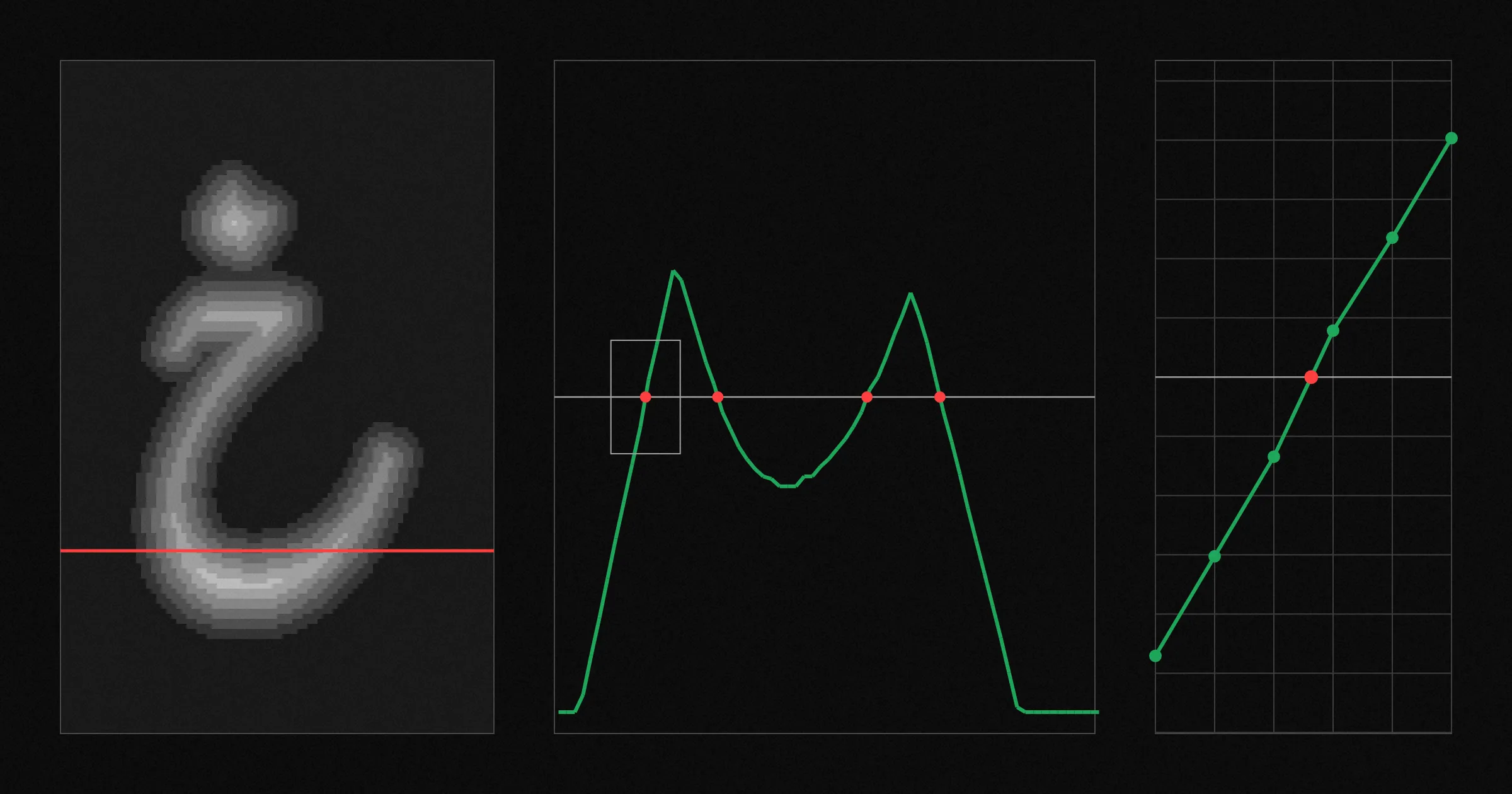
The right panel enlarges one crossing. It falls between two cells, and its position is calculated from their values. The outline is therefore not limited to the grid. A small prediction error moves the nearby edge. It does not break the rest of the outline like outline prediction would. The tracer follows the zero crossings to construct a new Bézier outline.
The next figure shows a small patch of the field cell by cell. Each cell lists its distance in pixels: negative outside and positive inside. The red outline passes through the interpolated zero crossings. This patch contains a thin stroke, so the outline crosses it twice.
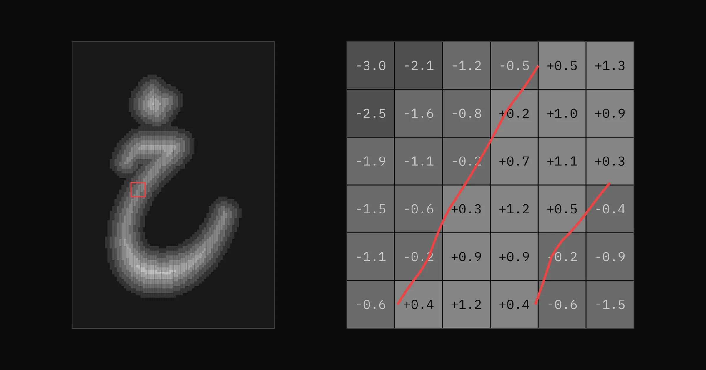
Each signed-distance field uses the same 155×219 grid at 64 pixels per em. Nasta’liq needs this large canvas because swash tails and dots extend far from each cluster’s origin.
How the Neural Network Works
The current network is feed-forward: information passes through its layers once, from input to output. It does not loop or refine the result in repeated steps.
The network represents each input symbol with a short list of numbers learned during training. It combines the lists for nearby symbols into one compact description of the required shape. A decoder, the part of the network that turns this description into an image, expands it through five layers to produce the signed-distance field. A second output predicts the shape’s x and y offset. The renderer uses that offset to position the shape and traces the field into a Bézier outline.
The same decoder produces every shape. This allows it to reuse what it learns about strokes, curves, and dots that appear throughout Gulzar. The model can remain simple because it only has to reproduce one existing design. It does not need to understand the language or invent new forms.
Training
Training starts with random weights. For each example, the training code compares the model’s prediction with the recorded target and adjusts the weights to reduce the difference. Repeating this across the dataset gradually improves both shape and placement.
We use Candle to train the model because it provides tools in Rust and runs on CPU, Metal, or CUDA.
AI training is often associated with corporate data centers. NeuralType models are much smaller and more specialized. I trained this model locally on a Linux PC with an NVIDIA RTX 2060 SUPER, an inexpensive consumer graphics card with 8 GB of memory. One epoch takes about 100 seconds. After training, the finished model can generate shapes and positions locally (a process called inference), including in the browser demo above. This puts neural font development within reach of independent type designers and small foundries, with almost no compromises and full control over their data and workflows. I expect local model training to become a common part of font development.
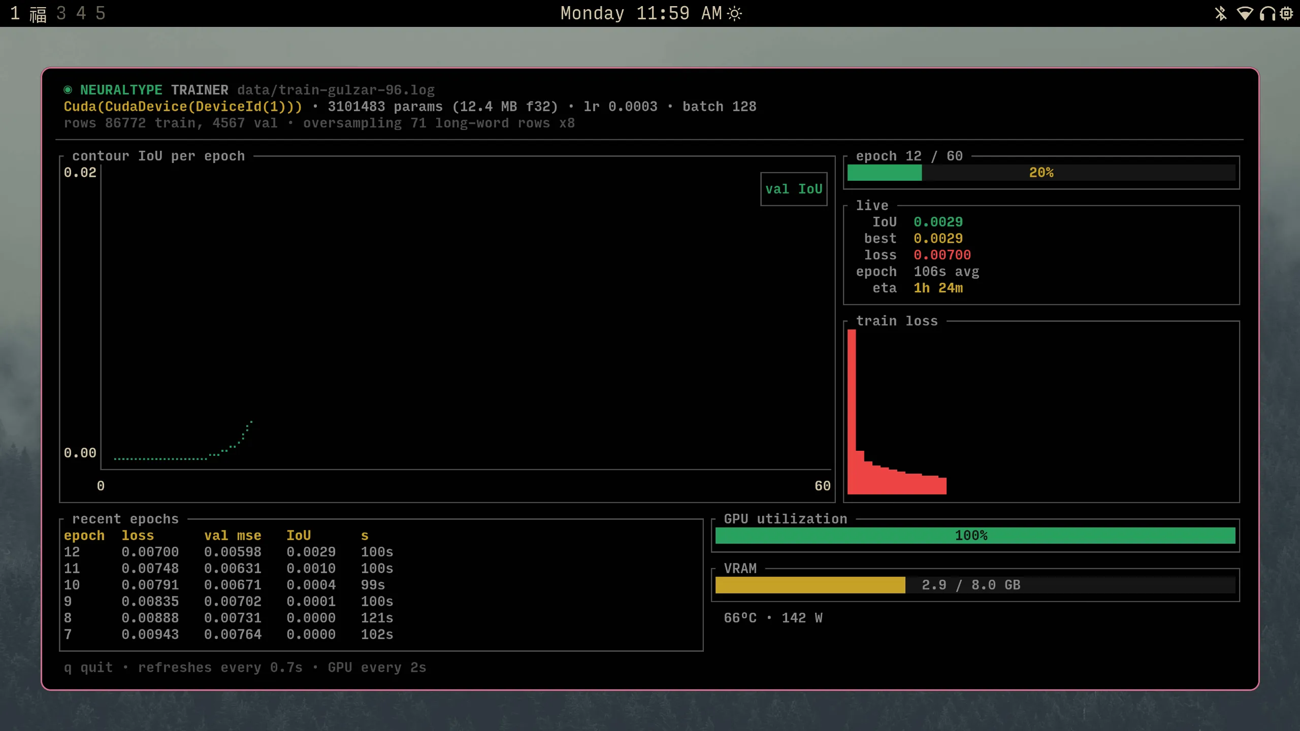
Training the larger 96 px/em experiment on a local Linux PC. The model uses 2.9 GB of the NVIDIA RTX 2060 SUPER’s 8 GB of memory and takes about 100 seconds per epoch.
After the model learned the main forms, I reduced how much the weights changed in each step. These smaller changes improved fine details without disrupting the larger shapes.
Shape accuracy is measured with intersection over union (IoU). It divides the area where the model output and target shape overlap by the total area covered by either shape. Identical shapes score 1.0. Shapes with no overlap score 0. The final model scored 0.945 on examples excluded from training. This score does not measure how the model handles new words: the held-out examples come from the same mostly short-string corpus as the training examples. It also measures shape only, not position.
Rendering the Output
The model outputs a field. The demo converts it to a Bézier outline before drawing it. It uses two tracers. While you type, a fast subpixel tracer draws each word. When input settles, img2bez replaces it with a higher-quality outline. img2bez is a Rust crate I built specifically for tracing AI-generated glyph images. It finds the edge, fits Bézier curves to it, and produces an outline that can be used in a font. Its settings can favor accuracy, smoother curves, or fewer points. The demo uses the Clean profile with a tight, faithful fit. It applies light smoothing and uses SmoothG2 mode to keep the joins between curves smooth.
The slower tracer runs in a Web Worker, separate from the thread that handles typing and drawing. The editor stays responsive, and each new outline appears when it is ready.
For this project, I added direct distance-field input to img2bez. It traces the model’s field directly, without first converting it to a conventional grayscale image.
The demo below shows img2bez tracing a raster glyph. This project gives it the model’s distance field instead, but uses the same tracing controls and curve-fitting code.
Results
The sheet below compares the teacher with the final model. Gulzar is gray on top. The model is green below.
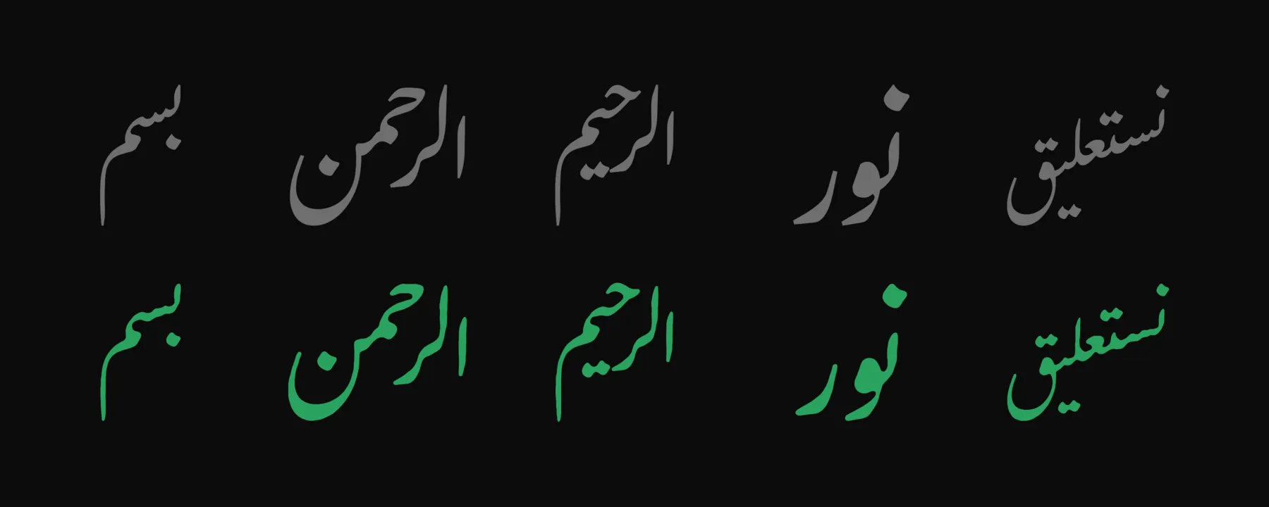
The final model has 1.36 million parameters and takes 1.38 MB, compared with 963 KB for the Gulzar TTF. It stores the weights as 8-bit values. The same weights take 5.4 MB when stored as 32-bit values. The precision controls in the demo let you compare the 32-bit, 16-bit, and 8-bit versions.
The two files do not perform exactly the same job. Gulzar stores glyph outlines and OpenType Layout tables for substitution (GSUB) and positioning (GPOS). A shaping engine such as HarfBuzz applies those tables using its Arabic shaping model. The .ntf stores a learned approximation of the resulting shapes and positions, but it also requires the NeuralType engine. The comparison therefore measures font data, not the complete software stack.
The 8-bit output is close to the original, but rounding the weights after training shifts some strokes and letter positions. Applying the same rounding during the last stages of training would allow the training process to compensate for these changes.
More training text would barely change the font’s file size because the .ntf stores weights, not training examples. New words made from the current letters and ligatures add no parameters. A new ligature or cluster token adds 24 8-bit weights and a short name, about 30 bytes. One hundred new tokens would add about 3 KB. The file grows substantially only if the network needs more capacity: each additional million 8-bit parameters adds about 1 MB.
Further file-size reductions are possible. We have not spent much time on optimization yet. One part of the model contains 84 percent of its weights. We could replace it with two smaller layers, for example.
The model card:
gulzar-int8.ntf | |
|---|---|
| size | 1,380,371 bytes |
| parameters | 1,357,995 |
| output | one 155×219 signed-distance field at 64 px/em, plus the cluster’s position relative to the word origin or previous cluster |
| coverage | 31 Arabic letters, plus the لا and لله ligatures |
| training data | 30,807 input strings, 91,390 cluster records, and 1,150 shapes |
| teacher | Gulzar Regular shaped with HarfRust, the Rust port of HarfBuzz |
| compute | about 8 minutes per epoch on an Apple M4 CPU; about 100 seconds on an NVIDIA RTX 2060 SUPER |
| validation | IoU 0.945 |
Failed Scaling Attempts
I ran three quick tests without adjusting the training settings for each model. Raising the field resolution from 64 to 96 px/em made the model 2.3 times larger but produced no visible improvement. Doubling the width of its layers made the model four times larger, but strokes became too heavy and joined where they should remain separate. A transformer trained to predict outlines produced fragments.
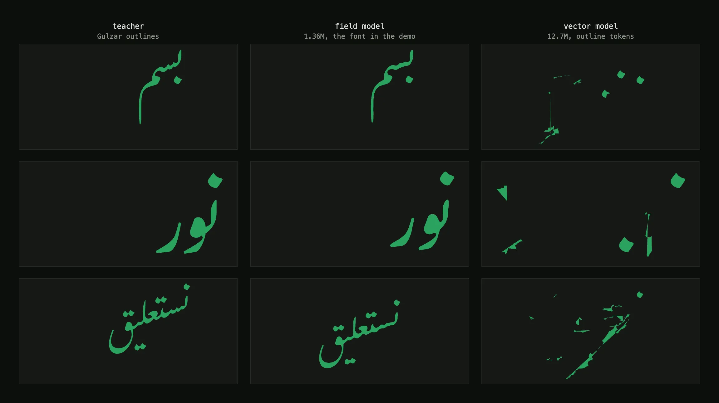
| trainable parameters | f32 export | result | |
|---|---|---|---|
| field, 64 px/em | 1,357,995 | 5.4 MB | IoU 0.945, compressed to 1.38 MB in the demo |
| field, 96 px/em | 3,101,483 | 12.4 MB | IoU 0.825, no visible gain |
| field, 64 px/em, wide | 5,357,091 | 21.4 MB | IoU 0.809, strokes merge |
| vector, outline tokens | 12,693,639 | 53.3 MB | accuracy 0.482, fragments |
These results apply only to these runs. They show that none of these simple changes improved this model, not that larger networks or direct outline prediction cannot work.
Beyond This Model
The next step is a Nasta’liq font designed from the start for NeuralType. Its model should consider nearby text and available space when making compositional decisions about letterforms, placement, and negative space, as a calligrapher would. Creating this font will require an editor for designing and training neural-network-based fonts.
Project Status
I will be at ATypI 2026 in Sharjah and available to demo a prototype of the editor and the first Nasta’liq font designed for NeuralType. Companies, independent designers, and engineers interested in exploring this approach can get in touch to discuss the project.
Development happens in the post-opentype repo, with the current plan in docs/DISTILL.md. The distilled font is licensed under the OFL and retains Gulzar’s copyright notice and credit.